
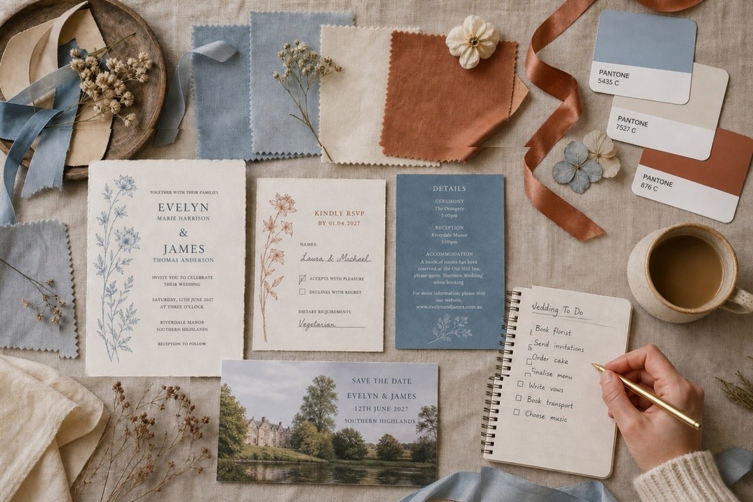
Building a wedding color palette usually starts the same way: hundreds of saved pins, a dozen palettes that all look right, and then no clear path to a single cohesive vision. The better method is to start from one fixed point you cannot change, build outward from there, and stop at five colors.
A palette is not a mood board. A mood board collects things you like. A palette is a set of rules that tells every vendor, including your florist, your stationer, and your cake maker, exactly how to work together so the day looks like one coherent vision rather than a beautiful accident.
- How many colors: 3 to 5 total. Fewer can feel flat; more is hard to coordinate across every vendor.
- The four roles: dominant, secondary, accent, neutral. Every color needs a job.
- Starting point: fix one element you cannot change, such as your venue, dress, or bridesmaids’ fabric, and build the rest of the palette around it.
- The 60/30/10 split: dominant color covers roughly 60% of the visual weight, secondary 30%, accent 10%.
- Light test: check your swatches in the venue at the time of your ceremony and again in the evening under artificial light.
- Locking point: the invitation is the first time guests see your palette, which is why it has to be finalized before you print.
It is the first thing guests see in your colors, months before the day.
How Many Colors Does a Wedding Palette Actually Need?
The honest answer is three to five. Most working palettes have one dominant color, one or two supporting colors, one neutral, and sometimes a single accent. If you go above five you will spend the whole day color-managing: making sure the napkins match the ribbon, and the ribbon matches the stationery insert, and none of it clashes with the venue carpet.
The Four Roles: What Each Color Is Actually For
Think of your palette as a small team where every member has a specific job.
The dominant color
This is the color the day is remembered by. It appears in the largest visual areas: main table linens, the ceremony backdrop, the largest run of florals, and bridesmaid dresses if you are dressing them in one color. A deep navy reads formal and romantic; a warm terracotta reads relaxed and earthy. Choose it because you love it, not because it is trending.
The secondary color
The secondary color supports and amplifies the dominant. It lives in smaller florals, in napkins and chair ties, in boutonnieres, and in the secondary elements of your stationery: borders, envelope liners, and headers. You might have two secondary colors, but treat that as two parts of one shared role rather than two competing colors.
The accent color
The accent is used sparingly, at roughly 10% of the total visual weight. It often appears as a metallic (gold, copper, or silver) or as a single saturated tone that adds contrast. Wax seals, foil type on an invitation, candle tapers on a table, the calligraphy ink on a menu: these are accent moments.
The neutral
Neutrals do more work than people give them credit for. They provide visual rest, they make text legible in print, and they allow the other three colors to sit against something calm. Warm ivory, champagne, soft beige, and taupe are the workhorses of most contemporary Australian wedding palettes. A cool palette might use soft white, silver, or pale gray instead.
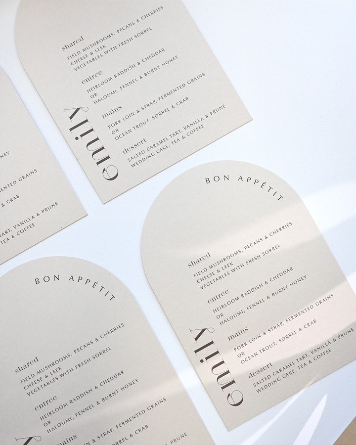

How to Build a Palette from a Fixed Starting Point
The easiest palettes start from something fixed. Common starting points:
Your venue. If your venue has a strong existing color, a terracotta floor, dark timber, or a garden of hedges, your palette has to live alongside it, not fight it. Pull one color from it and build from there. A room with warm ivory walls and dark timber floors has already decided your neutral; accent colors layer on top.
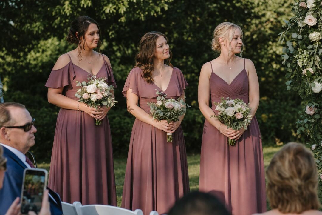
Your dress fabric. A warm ivory silk, a crisp white duchess satin, and a soft blush tulle all read differently in photographs and in person. Match your palette neutrals and secondary colors to your fabric rather than choosing them in isolation.
A piece of art or a place that matters to you. If you got engaged somewhere with a specific color memory, a garden, a sunset, a particular spot, start there. Palette tools that pull colors from a photograph work well: upload the image and note the three or four tones your eye gravitates toward.
Once you have your starting point, apply the 60/30/10 structure from the cheat sheet above and you have a working brief for every vendor.
For couples wanting to explore specific seasonal directions, including what works in Australian winter weddings (June through August) or the high-summer months that run from October through February, the seasonal color schemes guide covers those in depth.
Order a sample before you commit a palette to print.
Why Your Palette Has to Work in Two Kinds of Light
This is the single most commonly skipped step in building a palette, and it is the reason a palette that looked perfect on a mood board looks slightly off in the wedding photographs.
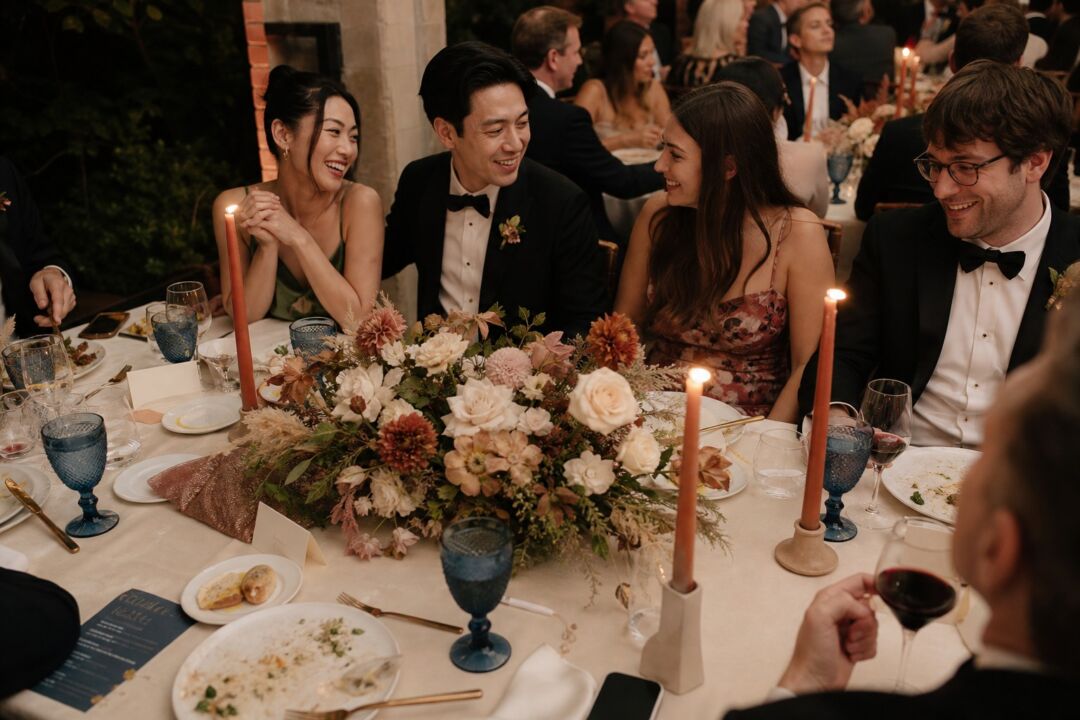
Daylight and artificial light do different things to color. A dusty blue that looks calm at 2pm can look slightly green under warm tungsten lighting at the evening reception.
The test is simple: take your fabric swatches and paint chips to the venue at the same time of day as your ceremony, and then again at the time of your reception. Look at how the colors interact with the actual walls, flooring, and chairs rather than with a white background. If the venue shifts from natural to artificial light mid-event, as most do, check your palette under both.
For the stationery, print a physical proof before approving the full run. A digital file that looks right on your monitor can look different on paper, and checking the proof in your actual space is the only reliable test.
How a Palette Reads in Photographs
Your wedding photographer will spend the day looking for the cohesive story your palette creates, so it is worth thinking about photography before you finalize.
Colors read differently when they are compressed into a two-dimensional image. Bold colors that feel balanced in a room can dominate a photograph if there is too much of them in the frame at once. A working palette for photography uses neutrals in the largest visual planes (the table, the floor, the backdrop) so that the dominant and accent colors pop rather than compete.
Skin tones interact with your palette too. Warm neutrals (ivory, champagne, soft beige) tend to be flattering across a wide range of skin tones. Stark white can read as harsh in direct light.
Greenery behaves like a neutral in photographs, so use it freely without worrying about it competing with your chosen palette colors.
The Invitation Is Where the Palette Gets Locked
There is one point in the planning process where your palette stops being theoretical and has to become fixed. That point is the invitation.
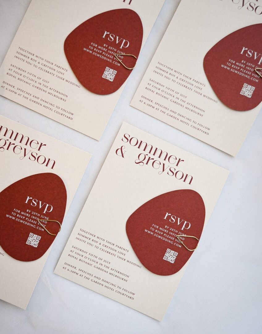
The invitation is the first time guests see the palette in physical form and the first piece of stationery to go to print, typically nine to twelve months out for larger guest counts. A full run cannot be reprinted without significant cost, so the invitation design forces every color decision to be final.
The invitation then functions as a reference document: once printed, share the physical card with your florist, your venue stylist, and your cake designer and say, plainly, “match this.” Hex codes and Pantone references are useful; a card every vendor can hold is better.
Print technology means colors reproduce differently across methods: a deep navy in digital print can read differently from the same shade in letterpress on cotton stock, and foil reads differently from its printed equivalent. Order a proof and check it in real light before signing off.
If you want to explore specific color combinations for your invitation suite, including designs that work across the full spectrum from minimal two-tone palettes to richer four-color styles, the Paperlust wedding invitation collection is searchable by color. Warmer earth palettes are the clearest example: terracotta wedding invitations read very differently on cotton stock than the same color does on screen.
Invitation designs in every palette, personalized online. The $5 sample pack puts seven designs and an envelope in your hands, including real foil and letterpress, so you judge paper and finish off a screen.
Frequently Asked Questions
How many colors should be in a wedding color palette?
Three to five is the practical range. Three colors, one dominant, one neutral, and one accent, produces a clean and intentional result. Four gives flexibility across vendors. Five is the ceiling: above that, coordinating florals, fabric, paper, and cake decoration across multiple suppliers becomes genuinely difficult without one color feeling out of place.
What is the difference between a wedding color palette and a wedding theme?
A theme describes the overall concept (garden party, black tie, rustic), while a palette is the specific set of colors that brings that theme to life. You can have a garden party wedding in dusty blue and ivory or in terracotta and sage, and both are valid. The palette is how you make the theme specific and coordinated across every visual element.
Should bridesmaid dresses match the invitation color exactly?
No, and trying to achieve an exact match is where couples run into trouble. Fabric and ink are different materials and they absorb light differently, so a perfect match is rarely possible. The better goal is color family harmony: if your invitation features a dusty sage, your bridesmaids’ dresses should sit within the same cool green family rather than being an exact ink match.
When in the planning process should the palette be finalized?
Before the invitation suite is designed. The invitation is the first piece of stationery to go to print and it becomes the physical color reference your other vendors will work from. If your palette is still uncertain when you start on your invitations, resolve it first: finalize your fabric swatches and paint chips, test them in your venue, and confirm with your florist before briefing your stationer.
How does a palette work for a wedding across different seasons?
The dominant, secondary, accent, neutral structure applies year-round. What changes is which colors suit each season in terms of light, venue landscape, and floral availability. Australian summers (October through February) favor lighter, airier tones that read well in bright midday light. Winter weddings (June through August) carry richer, deeper colors well because low-light conditions make jewel tones and warm neutrals look especially good.