
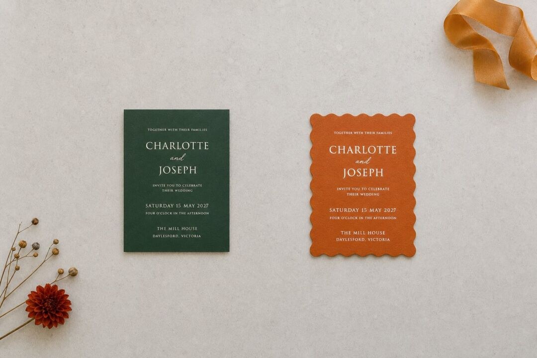
Season shapes your wedding palette before almost anything else does. The light in your ceremony space, the florals your florist can source that month, the textures that feel right on a table: all of it shifts with the time of year. A palette that maps to your season looks inevitable. One that fights it shows up in photos.
Most seasonal guides carry a blind spot: they assume you are in the northern hemisphere. A March wedding is spring in Nashville and autumn in Melbourne. A December wedding is winter in Boston and high summer in Sydney. This article organizes by season, not by month, and gives you the calendar for both hemispheres upfront so you can find your season and use it.
Season calendars, both hemispheres:
- Spring: September through November in Australia, March through May in the United States
- Summer: December through February in Australia, June through August in the United States
- Fall (Autumn): March through May in Australia, September through November in the United States
- Winter: June through August in Australia, December through February in the United States
Wedding color schemes by season: quick reference
| Season | AU months | US months | Palette mood | Named combinations |
|---|---|---|---|---|
| Spring | Sep-Nov | Mar-May | Soft, fresh, floral | Blush + sage + ivory; lavender + soft gold + white; peach + dusty rose + eucalyptus |
| Summer | Dec-Feb | Jun-Aug | Warm, bright, airy | Coral + ivory + champagne; cobalt + cream + lemon; terracotta + warm white + olive |
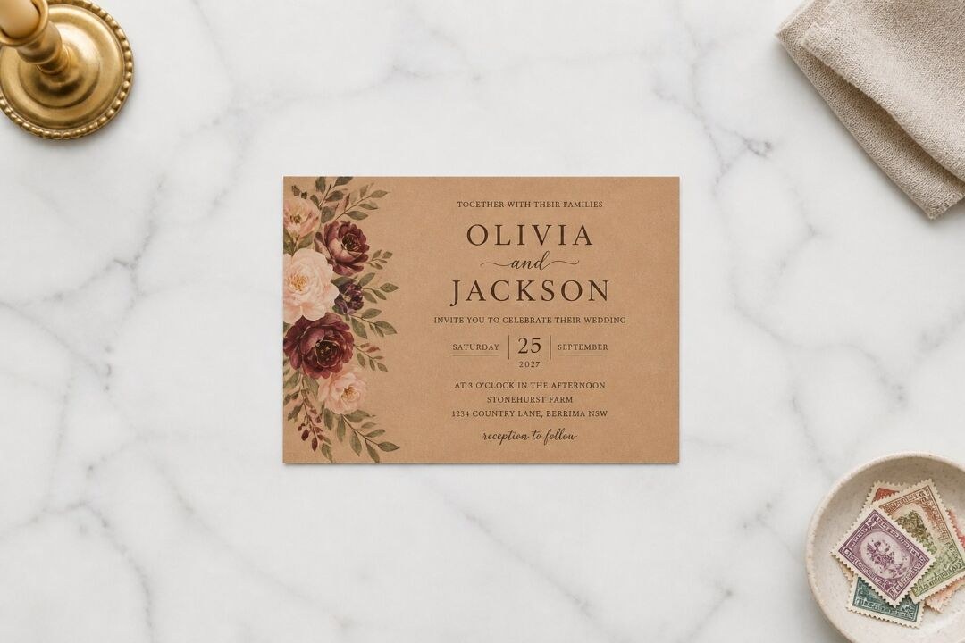
| Fall / Autumn | Mar-May | Sep-Nov | Rich, earthy, warm | Burgundy + copper + cream; terracotta + rust + sage; plum + forest green + ivory |
| Winter | Jun-Aug | Dec-Feb | Deep, jewel-toned, metallic | Navy + silver + white; emerald + gold + ivory; slate + dusty rose + champagne |
Your colors are set by the first thing you post, not the last.
What color schemes work for a spring wedding?
Spring carries one dominant quality: softness. The light tends to be diffused and even, which suits lighter palettes and keeps pastels from going flat.
Blush, sage, and ivory is a commonly requested spring combination. Blush reads warm in low light and neutral in direct light. Sage bridges florals and foliage without competing for attention. Ivory prevents the palette from reading too pink and gives paper, linen, and cake a clean base.
Lavender, soft gold, and white works well for couples who want a floral reference without going pink. Lavender reads cool in photographs while still feeling warm in person. Soft gold anchors it without tipping into anything too formal.
Peach, dusty rose, and eucalyptus runs a shade warmer and suits outdoor ceremonies. In Australia, this combination pairs naturally with native foliage. In the United States, it works for garden and vineyard settings from late March onward.
The practical note on spring pastels: the version that photographs well is always a shade or two deeper than the version on the paint chip. Ask your florist for samples in natural outdoor light before you commit to the full palette.

What color schemes work for a summer wedding?
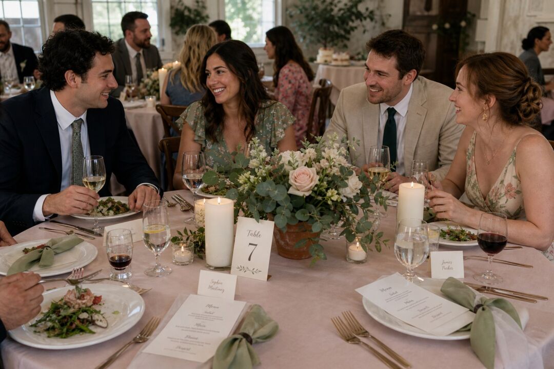
Summer light is stronger and more directional than spring light. Palettes that look lush in October photographs can appear washed out under June or January sun. Summer rewards two opposite approaches: go brighter than you think you need to, or go so neutral that the light itself becomes part of the palette.
Coral, ivory, and champagne is the warm middle ground. Coral holds enough saturation to stay visible against bright sun. Ivory softens what could otherwise read too intense. Champagne metallics add dimension at the reception when the light drops.
Cobalt, cream, and lemon is the bold version. Cobalt is one of the few blues that does not go gray in direct sunlight. Lemon yellow prevents the combination from reading nautical when you pair it with cream rather than white. This works at beach venues in both hemispheres.
Terracotta, warm white, and olive green reads as late summer in the United States and full summer in Australia (December through February). It suits outdoor ceremonies in direct sun and photographs well across a wide range of skin tones.
What color schemes work for a fall or autumn wedding?
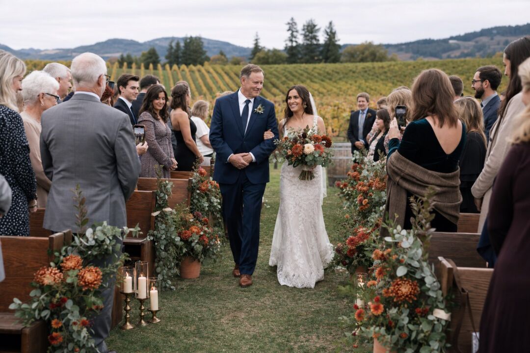
Fall is the season where color does the most work. The light is lower and more golden, which deepens reds and warms oranges. Palettes that were designed for spring can look flat and cold at a fall ceremony when the sun is at a low angle.
Burgundy, copper, and cream is one of the most reliable fall combinations. Burgundy holds its depth in photographs and pairs naturally with the golden-hour light of fall ceremonies. Copper brings metallic warmth without the cool of silver. Cream keeps the palette from reading too heavy across a full table setting.
Terracotta, rust, and sage is the earthier version. It suits vineyard, winery, and barn venues particularly well. In Australia’s March through May autumn window, this palette maps onto the landscape of the Yarra Valley, Hunter Valley, and Barossa wine regions in a way that feels intentional rather than imported. In the United States, it suits October ceremonies across the South and Midwest.
Plum, deep forest green, and ivory is for couples who want the richness of the season without orange or red. It reads slightly more formal and suits heritage buildings, candlelit interiors, and evening receptions.
The companion article in this cluster covers the full US fall color library.
Metallic and silver designs read very differently in print.
What color schemes work for a winter wedding?
The most common mistake in winter palettes is treating white as a palette rather than as a base. All-white winter weddings photograph cleanly in styled editorial shoots and go cold in candid reception shots. Adding one deep or jewel tone is usually the fix.
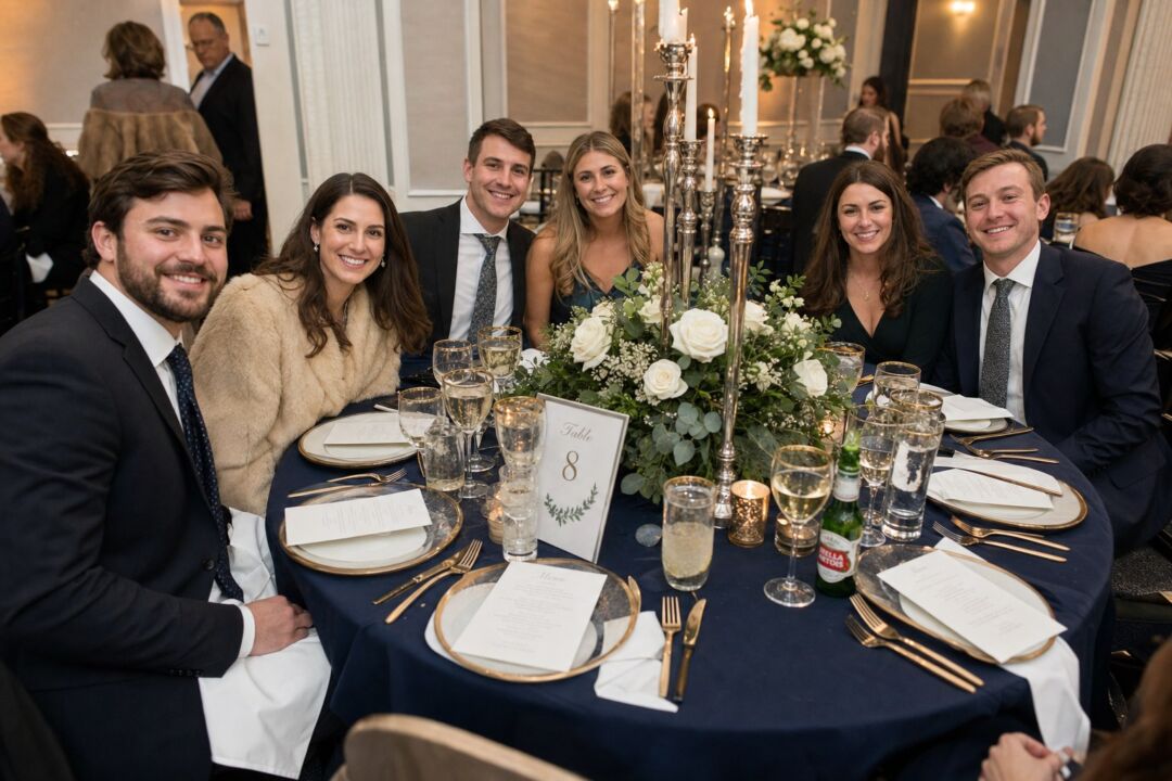
Navy, silver, and white is the classic version. Navy provides depth without warmth, which suits winter’s cooler light conditions. Silver stays seasonal. White linens and stationery give the combination contrast without competing for attention.
Emerald, gold, and ivory is the warm version. Emerald is rich enough to carry a room but not so seasonally specific that it reads as a Christmas palette outside of December. Gold brings warmth that silver cannot, and ivory rather than white keeps the combination from reading cold under overhead lighting.
Slate, dusty rose, and champagne is the softer alternative for couples who want romance rather than drama. This combination reads well in candlelight, which is almost always the primary light source at winter evening receptions.
Australian winter deserves a specific note. In Melbourne and the south, June through August daylight hours are short and the light sits closer to European autumn than anything familiar to northern hemisphere couples. Rich palettes respond well: deep teal, jewel-toned blues, warm emerald, and burgundy all hold in that light. In Sydney and Brisbane, the winter is mild and bright, which opens the range toward the muted and neutral end.
How your color scheme connects to your stationery
Your color palette is often the first decision your stationer asks about, because it sets the constraints for every paper and printing choice that follows. A blush and sage spring palette suggests soft-toned papers and delicate letterpress textures. A burgundy and copper fall palette opens the door to deep color stocks, flat foil stamping, and heavier cotton papers.
If you have a palette but haven’t settled on a design, the Paperlust wedding invitations collection is organized by printing style so you can match palette to paper and finish combination. Winter is where metallics earn their place, and silver wedding invitations carry a cool palette without tipping into a holiday card.
The palette-to-paper logic is straightforward: darker palettes tend to contrast well against white or cream stock, where lighter palettes often look more cohesive on tinted or textured papers. A designer proof shows you both options before anything goes to press.
Invitation designs across every season, personalized online. The $5 sample pack puts seven designs and an envelope in your hands, including real foil and letterpress, so you judge paper and finish off a screen.
Frequently asked questions
What is the most popular wedding color scheme?
Blush and sage is a consistently popular combination because it works across all four seasons. Blush shifts warmer or cooler depending on the undertone you select, and sage foliage is available from florists in most months. The combination carries from a spring garden ceremony to a fall barn setting without modification.
What wedding colors work for a fall rustic wedding?
Burgundy, terracotta, and rust are the anchors of the rustic fall palette. Burgundy is the most flexible of the three: it pairs with copper for warmth, sage for contrast, or ivory for a softer result. For a rustic venue, the palette does the seasonal work and the texture does the venue work. Dried grasses, raw wood, linen, and natural ceramics reinforce the setting; the colors reinforce the season.
What wedding colors work for spring?
Blush, lavender, peach, and soft sage are the most commonly requested spring colors. The practical reason is that these hues hold well in the even, diffused light that spring daylight provides in both Australia and the United States. Bold spring palettes are less common but workable: coral and white, for example, photographs well in spring sun and can look striking at an outdoor ceremony.
Can I use a fall palette for an Australian March or April wedding?
Yes, and it will feel natural rather than borrowed. March and April in Australia are solidly autumn, so the earthy, warm-toned palettes associated with fall in the northern hemisphere are seasonally correct. Terracotta, burnt orange, burgundy, rust, and warm sage all suit the light and landscape of an Australian autumn ceremony.
What is the difference between a wedding color scheme and a wedding color theme?
A color scheme is the specific set of colors: blush, sage, and ivory, for example. A color theme is the broader mood or concept the colors express, such as garden romance or earthy harvest. The usual order is theme first, then the specific shades that express it. A florist needs specific shades to source; a stationer can usually work from either.
What are good burgundy wedding color combinations?
The most commonly requested combinations are burgundy with gold and ivory, burgundy with copper and cream, and burgundy with sage and blush. Less common but equally effective: burgundy with dusty blue and ivory, or burgundy with mustard and soft brown. Burgundy works best as the clear lead color, with the rest of the palette built around it.