
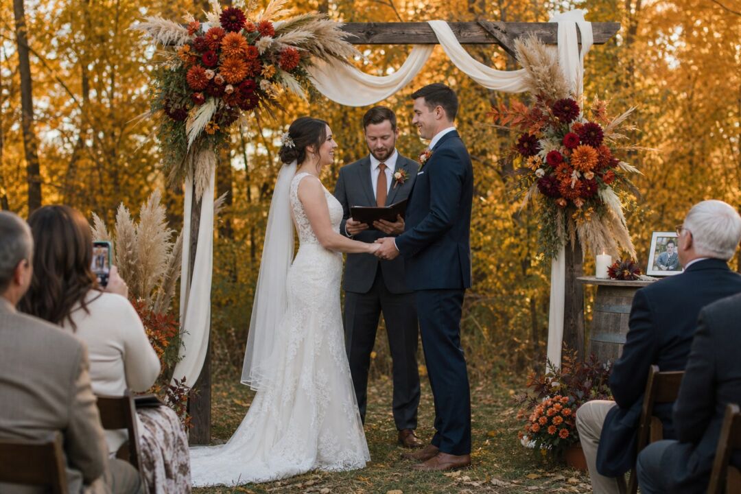
Fall gives you a color window unlike any other season. The light turns amber by mid-afternoon, the foliage pulls every warm hue into focus, and the palette you choose in September works completely differently than the same colors do when November closes the sun down by five. That difference matters for your photos, your reception lighting, and your stationery.
What follows are the specific combinations that hold across September through November, with hex codes you can hand directly to your florist, calligrapher, and stationer, plus the answer to the question nearly every fall couple asks: how to use burnt orange without it reading as Halloween.
General season-to-palette strategy and sage green as a full theme are covered in separate articles and left out here so this guide can go deeper.
- Rust and cream (#B5541C + #F5F0E8 + #D4AF37): warm, traditional, holds under any light
- Plum and slate (#4A1C40 + #8A9BB0 + #F5EFE6): sophisticated, photogenic in November’s flat light
- Burgundy and champagne (#7C2036 + #F7E6D1): formal, works equally well indoors and out
- Burnt orange, sage, and ivory (#B5541C + #87A68A + #F5F0E8): the most versatile warm combination
- Mustard and navy (#B8860B + #1B2A4A): unexpected, holds its visual presence into full artificial light
It is the first thing guests see, and it sets what everyone expects the day to look like.
Five fall palettes worth naming
Rust and cream
Rust sits between orange and brown, muted enough to stay clear of Halloween territory and deep enough to hold warmth in November’s flat, overcast conditions.
Working combination: rust (#B5541C or #C1440E) as the primary, ivory (#F5F0E8) as the base neutral, antique gold (#D4AF37) for metallic accents. This palette is not temperature-sensitive the way true orange is.
Plum and slate
The most underused fall combination. Deep plum (#4A1C40 or #622E42) paired with cool slate (#8A9BB0) reads sophisticated in a way pure burgundy does not. The slate anchor keeps the plum from going theatrical.
Add warm ivory (#F5EFE6) as a third neutral. Plum holds under amber light and gets richer, which makes this the strongest option for late October and November weddings where the ceremony runs into dusk.
Burgundy and champagne
More formal than rust-and-cream. Burgundy (#7C2036 or #6B1D30) with champagne (#F7E6D1) suits ballrooms, vineyard buildings, and manor venues, and reads equally well on digital print stationery and on foil-stamped card stock.
One practical note: burgundy deepens under certain warm reception lighting, which is generally flattering, but it can go muddy under cool-white overhead lighting. Ask your venue coordinator about bulb temperature before the event.
Burnt orange, sage, and ivory
This is the combination that holds across every lighting condition the season produces. Burnt orange in the #B5541C to #E07A5F range, with sage green (#87A68A) and ivory (#F5F0E8), is warm enough to hold under artificial evening light but not so saturated it dominates in bright outdoor afternoon photographs.
The sage reads botanical and earthy rather than festive, which keeps the burnt orange from tipping into seasonal-decoration territory.
Mustard and navy
The fall palette that surprises people. Mustard (#B8860B or #DAA520) is bold enough to read as a statement color but warm enough to stay firmly in the fall register. Navy (#1B2A4A) gives it formal grounding that works across venue types.
Particularly good for October and November receptions that run into full darkness: navy and mustard hold their visual presence under warm overhead lighting where softer palettes can wash out.

Burnt orange without Halloween
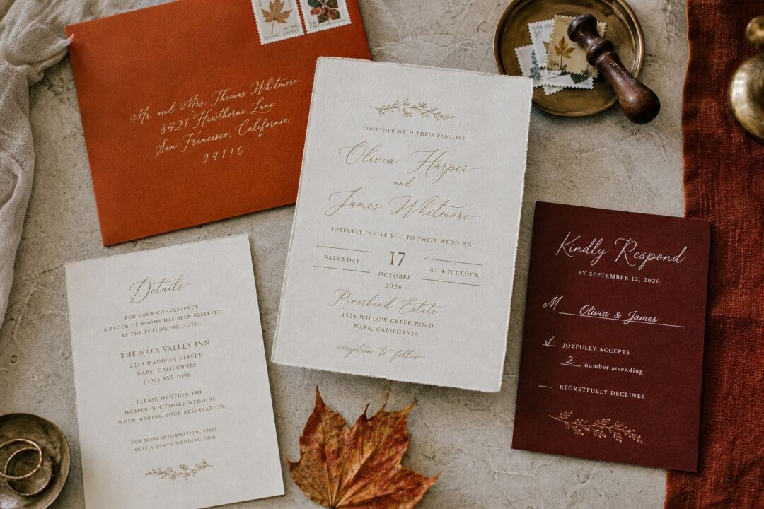
The single mistake that tips burnt orange into costume territory is a specific trio: orange plus black plus bright purple. The fix is not to avoid orange. It is to avoid that combination.
Muted, earthy oranges in the #B5541C to #C4663A range read as autumn harvest. A saturated #FF6600 reads as a traffic cone. The difference is visible at a glance.
Anchor the palette in the right neutrals. Ivory, cream, linen, and warm beige all pull orange toward harvest. Antique gold (#D4AF37) or copper (#C8967A) metallic accents read warm and seasonal. Wood, rattan, and natural fabric textures extend that into decor and place settings.
For dark accents, choose chocolate brown (#5C3A1E) or walnut (#6D4C41) instead of pure black. For a second hue, choose burgundy (#722F37), sage, or dusty rose. If you use purple, keep it in the plum, wine, or fig range, where it reads as a jewel tone rather than a holiday reference.
On decor: wheat sheaves, dried grasses, and autumn foliage read as harvest. Orange gourds push the association the other way. Keep your design vocabulary pointed toward harvest rather than haunted. Most of it resolves.
A rust that glows on a monitor can sit flat on uncoated stock. Judge it on paper before you commit.
How fall light changes what your palette does in photographs
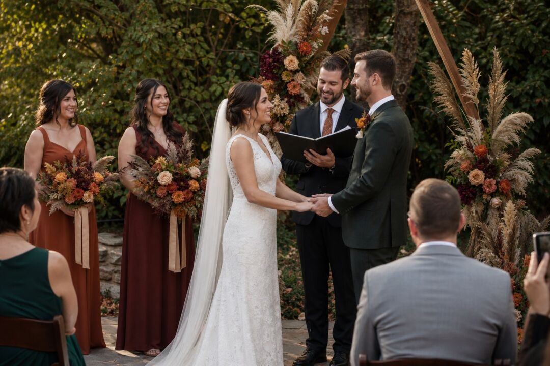
Fall light sits lower in the sky than summer light. By September, the afternoon is already moving toward gold, and the golden hour arrives earlier and warmer than in summer. Rust, mustard, burnt orange, and antique gold all photograph with extra richness during this window.
In November, the window closes faster. At a Northern states wedding with a ceremony starting at 4 p.m., outdoor golden-hour photography lasts roughly forty-five minutes before the reception moves to artificial lighting. Your palette for a November wedding is partly a reception-lighting decision, not just a ceremony aesthetic.
The pivot point is the cocktail hour. Warm amber lighting, in the 2700 to 3000 Kelvin range, deepens rust, burgundy, plum, and burnt orange, and makes antique gold glow. Ivory and cream stay warm and full. Warm palettes look richer indoors than they did outside.
Cool-white lighting at 5000 Kelvin or higher does the opposite: orange picks up a harsh edge, gold shifts toward greenish, ivory goes cold, and plum can go muddy. If your reception venue uses overhead fluorescent or cool-white LED lighting, a word with your coordinator before the event is worthwhile. Warm-amber bulbs are usually a straightforward swap, and candles at table level add warmth regardless of the overhead source.
The most reliable test: bring your bridesmaid dress swatch, your stationery suite, and a flower from your bouquet to the venue at the same time of day your reception will run. Thirty minutes of testing eliminates surprises that are expensive to fix the night before.
From screen to stationery: how color translates in print
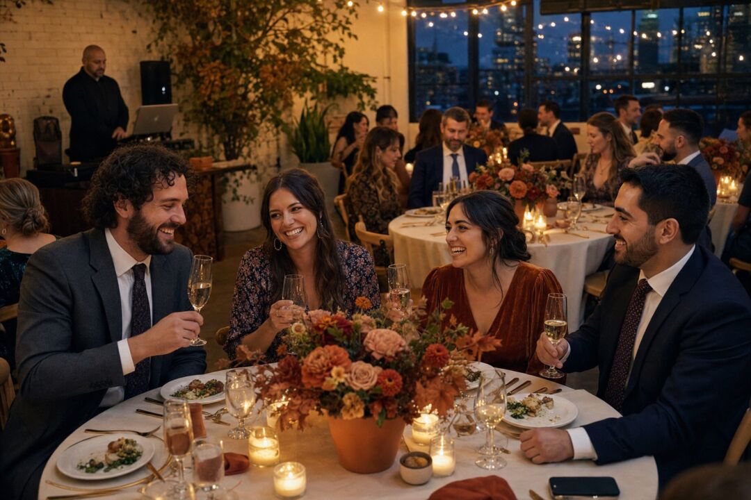
A fall palette built on screen needs adjustment before it translates to printed stationery. Screens emit light. Paper reflects it.
Burnt orange tends to print warmer and slightly more saturated than it looks on a backlit display. Rust needs no adjustment. Plum can shift slightly blue in digital printing at lower ink densities, so a richer base is safer than a lighter, more lavender version. Burgundy is very stable in print.
Metallic gold requires a specific print decision. Flat foil gives a mirror-bright quality that digital ink cannot replicate. Foil stamping adds a pressed, tactile depth. Metallic digital ink is the more affordable option with a subtler sheen that reads well on textured paper.
A deep burgundy on a textured cotton card reads softer and more organic than the same ink on a smooth white card. A printed proof before production is the most reliable way to confirm your chosen fall hues translate the way you intended.
Browse the fall wedding invitation collection at Paperlust to see how palettes translate across paper types and print methods. Terracotta is the palette that shifts most between screen and stock, so compare terracotta wedding invitations in print before committing to the shade.
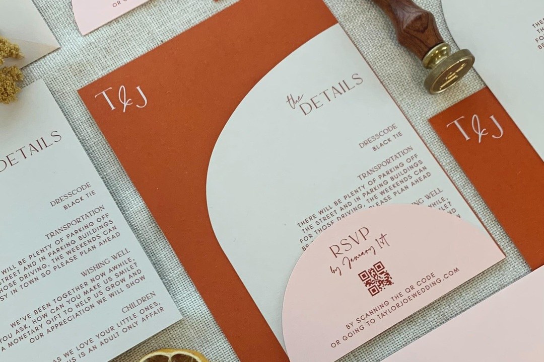
Autumn-toned invitation designs you personalize online. The $5 sample pack puts seven designs and an envelope in your hands, including real foil and letterpress, so you judge paper and finish off a screen.
FAQ
What is the most versatile fall wedding color palette?
Burnt orange, sage green, and ivory holds under both natural afternoon light and warm artificial reception lighting, which is the central challenge of the season. The sage prevents the burnt orange from reading as Halloween, and ivory works on every paper stock and linen color without looking stark.
How do I stop burnt orange from looking like Halloween?
Use muted, earthy orange in the #B5541C to #C4663A range rather than saturated pumpkin orange. Anchor it in ivory, cream, and warm neutrals rather than white and black. Use chocolate brown or walnut as your dark accent instead of pure black. The specific combination to avoid is orange plus bright purple plus heavy black, which is the trio the eye reads as Halloween.
Do fall wedding colors photograph differently than they look in person?
Yes, in two consistent ways. Fall’s golden-hour light arrives earlier than in summer and makes warm palettes glow in outdoor ceremony photos. The artificial lighting at your reception then determines whether your palette looks rich or flat indoors. Warm amber lighting in the 2700 to 3000 Kelvin range holds rust, burgundy, plum, and gold. Cool-white lighting at 5000 Kelvin flattens them. Testing your palette at your venue at the reception time of day answers both questions before they matter.
What fall palette works best for a November wedding?
Palettes with strong warm pigment, specifically rust (#B5541C), deep plum (#4A1C40), or burgundy (#7C2036), work best in November. These hold under warm amber reception lighting when the sun is down before 5 p.m. and most of the event runs under artificial conditions. Mustard and navy is also a strong choice for evening receptions. Softer, more pastel palettes, particularly those with significant cool-white or blue content, tend to flatten under the warm interior lighting that most November venues use.
What color falls flat in fall wedding photos?
Cool-white and pale blue palettes tend to underperform at fall receptions. Outdoors in afternoon sun they look crisp. Under warm amber reception lighting, pale blues shift gray, cool whites pick up a yellow cast, and the palette loses the contrast that made it work on the mood board. For cooler tones, slate-and-plum keeps some cool character while still holding under warm interior light.