2024 has flown by, and some definite trends have emerged on the wedding invitations scene. Now the year is halfway complete (I know, I know: so crazy!) it’s safe to say these trends are not going away anytime soon, and are set to stick around well into 2025 and beyond.
1. Foil Stamping
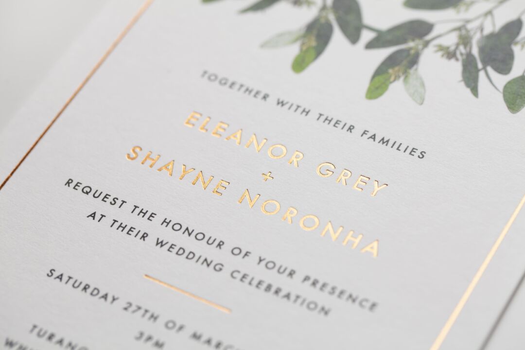
What is there to say about foil stamping? It is the height of class and makes your invitations look a million bucks. In fact, it can actually resemble a million bucks, evoking images of coins, buried treasure and expensive jewellery. Foil stamped wedding invitations have tied in well with the art deco/Great Gatsby theme that has taken the wedding world by storm since the release of Baz Luhrmann’s film in 2013.
There are so many options when it comes to foil stamping: you can use it to highlight key information like names or dates, you can have all your text in it, you can have an illustration in foil, or you can go all out and have your entire invite look like it’s been dipped in gold, silver or bronze. Whichever approach you take, foil stamping adds texture and interest to an invitation. It can take a fairly basic design to the next level or it can be the heart and soul of something really special designed around it.
For an extra glamorous touch, consider matching your foil stamping to your wedding rings or other significant jewellery. You could also carry the theme throughout the wedding, with metallic details popping up anywhere from the centrepieces, the bridesmaid dresses or the fabric wrapped around the bouquet stems. Metallic details are decadent, classy and timeless.
Browse foil stamped wedding invitations on Paperlust, or check out our Pinterest board full of foil stamped wedding invitation inspiration.

![]()
![]()
2. Watercolour
Watercolour is one of the hottest wedding invitation trends , and seems to pop up somewhere new every day. It’s popular for a reason! Watercolour is a great way of adding colour and texture to your wedding stationery, transforming an otherwise simple design. Match your wedding colours, or go for seasonal or environmental colour palettes – blue for a beach wedding, oranges for an autumn wedding.
While some people are actually making their watercolour wedding invitations by hand, most are opting for digital prints instead for consistent quality and ease. Wedding invitations are one thing you should think carefully before you choose to make yourself, since the amount of work involved is multiplied by the number of guests you have. Painting a quick watercolour might seem easy, but it can be more difficult than you expect once you factor in that multiplication! Keeping the same standard of work hundreds of times over is also difficult.
Artistic and colourful, watercolour prints give a handmade look and suit the DIY bride perfectly without the painful process of actually having to do the same DIY hundreds of times, leaving you free to focus on more interesting DIY wedding projects instead.
Browse watercolour wedding invitations on Paperlust or check our pinterest board for more watercolour inspiration
![]()
![]()
![]()
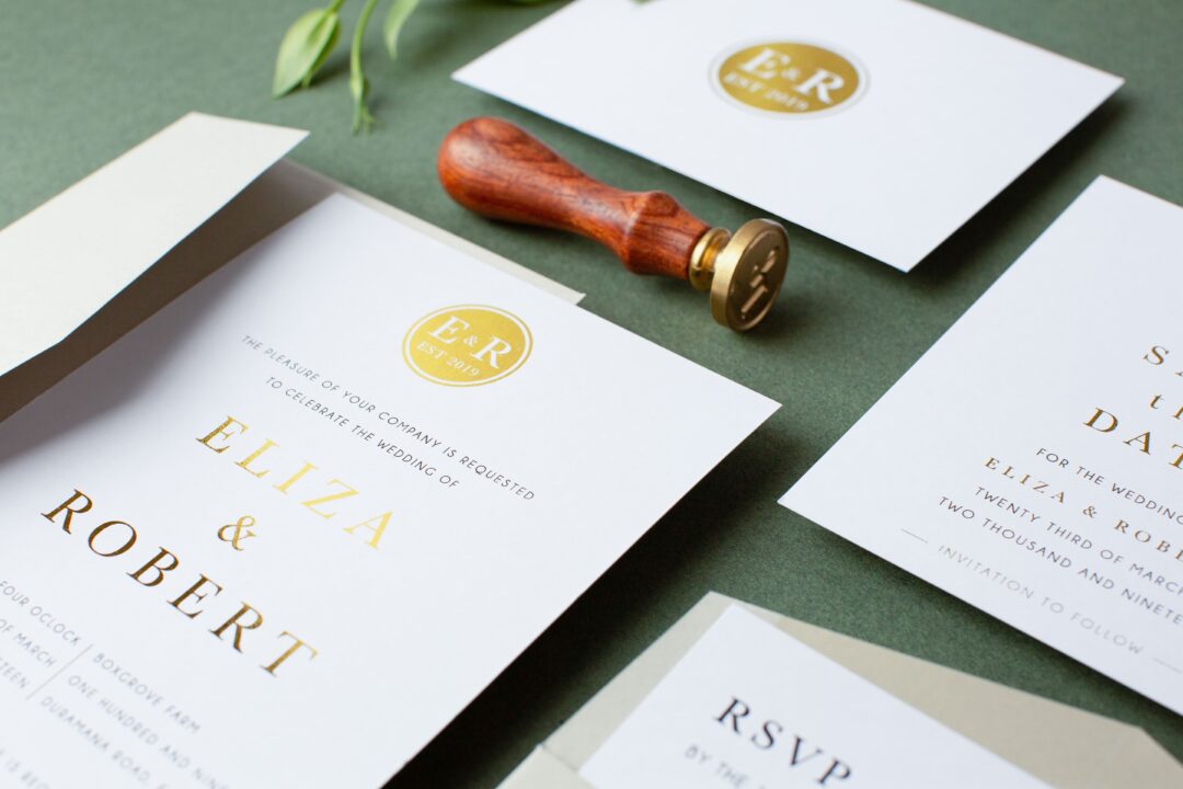
3. Monogram
Monogram wedding invitations have become a timeless favorite in recent years, and their popularity shows no sign of fading. For monogram invitations, it’s all about incorporating the couple’s initials in creative and sophisticated ways. These designs can feature classic, bold lettering or elegant, intricate flourishes, creating a personalized look that is uniquely yours.
Monograms are often paired with luxurious details like foil accents, embossing, or ornate borders to add a touch of elegance. Whether the monogram is subtly placed at the top of the invitation or prominently displayed in the center, it instantly sets the tone for a refined celebration. You can also mix and match fonts to create a style that suits your wedding’s vibe – from sleek and modern to traditional and romantic.
The monogram theme can be carried throughout the entire wedding, ensuring a consistent and personalized feel. Whether you go for a subtle look with monogrammed stationery or opt for a more elaborate approach with custom signage and wedding favors, the monogram ties it all together. It’s a perfect way to give your guests a preview of the stylish, personal celebration to come.
Browse monogram wedding invitations on Paperlust.
![]()
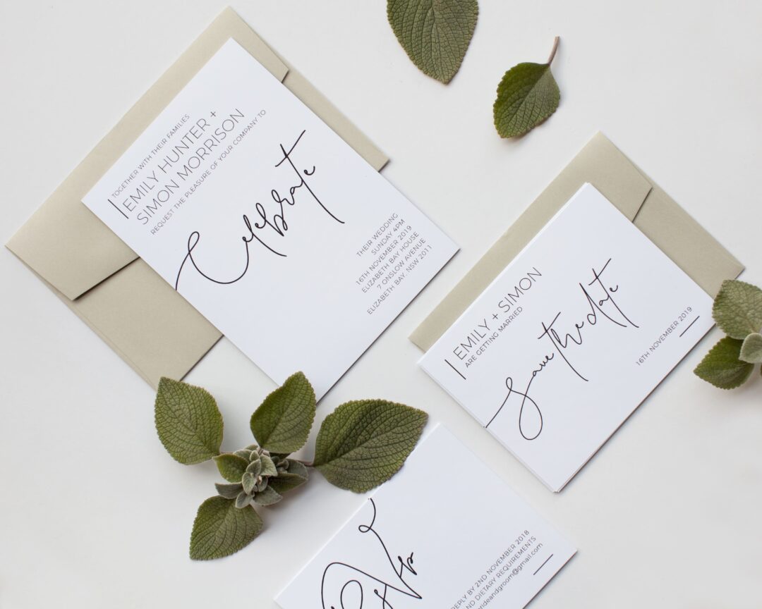
4. Attention on Type
The art of typeface is having a bit of a cultural moment: even those without a design background are coming to appreciate great typography and lettering, and many people are taking the opportunity to make the words the art on their wedding invitations. Keeping backgrounds simple, typography is being given centre stage. This is mostly being seen in chic monochrome, but can also be paired with a simple colour palette to great effect – think just one or two colours.
It may seem obvious, but your font of choice will make all the difference to your typographic wedding invitations. You can use script for a more whimsical approach, or go for a sleek sans serif for a contemporary feel. Couples are also mixing fonts to achieve all sorts of effects. The most important thing here is to choose quality typefaces and to make sure there is something uniting the different elements so you avoid the final piece feeling like a child played around with WordArt. For the best outcome make sure the spacing and layout of the design is sound and that other page elements are kept simple. A clear hierarchy of information is also vital for readability, regardless of whether you create this through space, colour, size, font choice, or something else entirely.
Browse typographic wedding invitations on Paperlust, or check out our Pinterest board full of typographic wedding invitation inspiration.
![]()
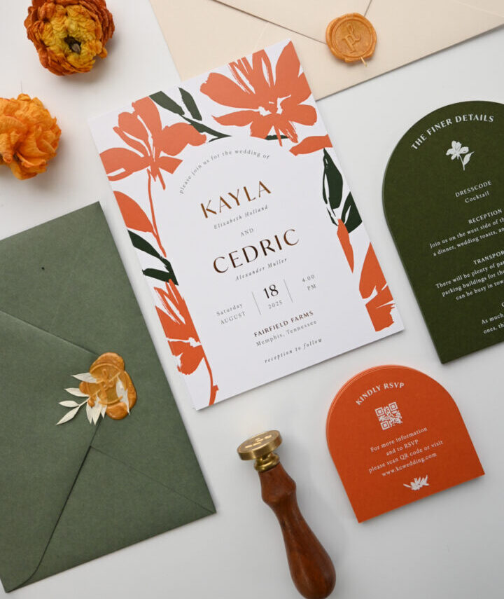
5. Illustrations
Talented illustrators are popping up everywhere at the moment, and brides are making the most of their artwork by featuring it on their wedding invitations. For a truly unique invite, some are opting for custom wedding invitation illustrations such as cartoons that resemble them and their fiancé, or a cute hand-drawn map of important wedding locations. Others are just using beautiful illustrations they love rather than having something custom made. Either way, guests will want to frame the invitation to hang as art.
If this is what you’re going for, talk to your chosen illustrator about designing the invitation as a whole, rather than taking one of their pieces and trying to make it work with an existing design. Allowing them control over the design will ensure a cohesive and elegant final product. If they don’t want to design the entire wedding invitation and prefer to stick to illustrating, be sure to find a designer who will take their cues from the illustration and bring elements from it into the lettering and layout. The illustrator may be able to suggest someone for you. If all else fails, keep the design simple and allow the illustration to take centre stage.
You should also consider early on whether you want the wedding invites to match the colour scheme of your wedding as a whole. If so, discuss with the illustrator the colours you have in mind, or wait and see what they come up with and use it to inspire your colour palette.
Browse hand drawn wedding invitations on Paperlust
![]()
![]()
![]()
![]()
![]()
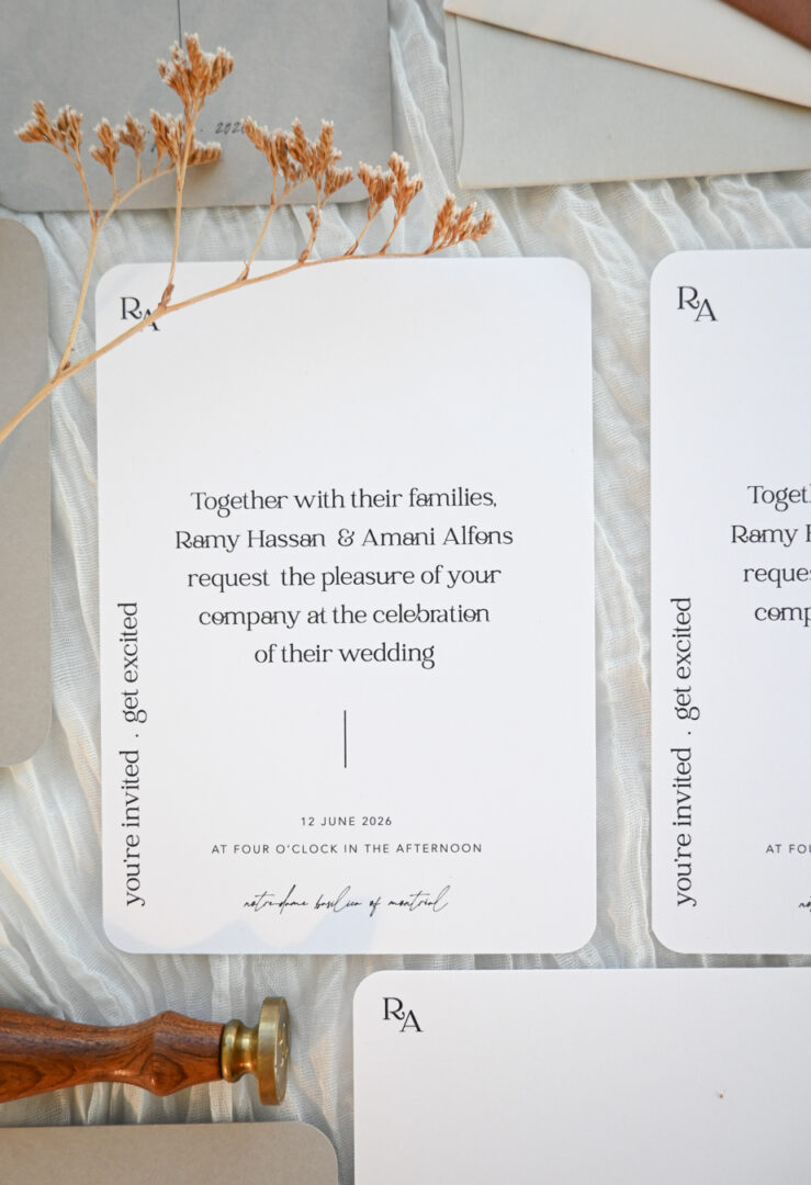
6. Sleek Minimalism
It’s almost impossible to go wrong with a chic minimalistic wedding invitation design. It is timeless, classy and eye-catching. Keep it simple and monochrome, or add one colour as a statement, and consider choosing a mix of simple type and script-based fonts that resemble calligraphic handwriting (but no more than two or three different fonts please!).
The most important consideration for a minimalistic design is the use of space. Make sure that what’s on the paper is placed perfectly and has lots of blank space around it to draw attention to the words and to create a clean, breezy vibe. It’s what you don’t include that matters even more than what you do. Avoid bright colours, large illustrations or anything too ‘trendy’. Keep things simple and classic for your invitation. Strip away anything that isn’t necessary and focus on making what is there both beautiful and functional: Make sure your wedding invitations are legible (especially script fonts) and contain all the necessary information in a way that is easily understood.
Minimalist design is an art form that looks deceptively easy to the untrained eye, but it takes skill to make sure every element on the paper looks like it was placed exactly where it ought to be. A balanced piece of minimalist design is a delight to look at: the perfect aesthetic for the classic bride’s wedding stationery.
Browse simple wedding invitations on Paperlust.
![]()
![]()
7. Bursts of Colour
Bright colours are fun, but can dominate your wedding invitations. By keeping to a simple monochrome, you can use small pops of colour to draw attention to key elements such as names or dates, or just use them to tie an otherwise simple wedding invitations suite into a more colourful wedding palette. This tends to work best with bright ‘statement’ colours such as fluoros, bold reds and other colours that might be more at home on a children’s playground. The black and white around the colour will balance out what might otherwise be overwhelming. It’s possible to go the other way and use a soft pastel or wash as your one colour element, but if the colour is subtle it’s better to use more of it to make sure it is seen and doesn’t look like it made it onto the paper by mistake!
This sort of design is similar in many ways to minimalism. Ideally a good burst of colour will be used to add a little something extra to a design that is already beautiful on its own. As such, you want to look for the same sort of things: balance, good use of negative space, and a minimum of different fonts. Keep any extra decorations symmetrical or grid-based, and it will keep from taking over the whole page.
Browse bold wedding invitations on Paperlust for more!
![]()
![]()
![]()
8. Names Take Centre Stage
Of course names have always been crucial to a wedding invitation. Not many people plan ‘surprise’ weddings where none of the guests have any idea who is getting married (although, to be honest, I’d totally go to a wedding like that! You can steal my idea as long as you invite me). But in 2016 there has been a trend toward making names the feature of the invitation, putting them front and centre. There are a few different ways to approach this: positioning, colour, foil stamping, letterpress, size, typeface or any combination of these.
If your names are going to be the feature of your wedding invitations you need to decide how you want them to be written before you worry about anything else. Do you want to emphasise your full names or just your first names? Will this be the only place your names are written on the invitation, or will they be repeated in the main text of the card? Some people will write their names at the top of the invitation in a decorative way but still include standard invitation wording below, while others opt to highlight the names in the actual wedding invitation wording. After you’ve made that decision you should consider your overall aesthetic. Do you want big calligraphic script or an ultra contemporary sans serif typeface? Should the names be colourful? Do you want them printed in letterpress or foil stamped?
The choices may seem endless, but don’t be overwhelmed. With these formal wedding invitations, the good thing about this trend is that you can make it your own while still embracing the traditional approach.

![]()
![]()
9. Oval Vignettes
Oval vignettes draw attention right where it needs to be, front and centre, and is a fun way of incorporating pattern, colour or even illustration (really any of the other trends listed here!) into your wedding invite while maintaining a clean layout and hierarchy. It’s a simple design element, but it’s one that is wildly popular this year. The oval-framed wedding invitation is a great option for framing your text if minimalism or large amounts of empty space aren’t your thing or don’t match your wedding style.
Many people are also employing this strategy for their save the dates, since there are usually not many words included on this part of the invitation suite. A beautifully decorated oval border is a great way to fill the extra space without distracting attention from the main point of the card.
This trend can be as simple or complicated as you want it to be. A simple decorative oval border can jazz up an otherwise simple design, or a busy and colourful edge can be used as a vignette to draw attention to the white space in the centre. The trick is this: the more intense the border, the more simple and clean you should try to keep the centre. It should stand out and be easy to read, while balancing the more out-there parts of the design.
Browse patterned wedding invitations or geometric wedding invitations on Paperlust, or check out our Pinterest board full of patterned wedding invitation inspiration.
![]()
![]()
![]()
10. Creative use of paper
It’s been all about clever use of paper in 2016, featuring cut-outs, non-traditional sizing and folds, layers, textures and anything else you can think of. Intricate laser-cut patterns are big, as well as layered peephole windows. Unconventional shapes are being used, with invitations printed on circles, ovals and triangles. Poster-sized invitations folded into brochures are making an appearance, along with newspaper inspired choices to celebrate the impending nuptials with a headline. Basically anything you can think of to do with paper is now possible, and that creativity is being celebrated in the trending wedding invitation designs of this year.
The trick to this is to make sure that the unconventional choice of paper is generally working with the design of the invitation itself, not competing with it. It works best when this is not being used as a gimmick, but matches the overall aesthetic. For example, in the pictures below, you can see art deco cut-outs being used with a simple but classic art deco invitation design, while the extremely unconventional geometric folding invitation is paired with fluro pink and asymmetrical layout. Creative use of paper can also be done in an understated way, such as printing square invitations rather than rectangular. This is just enough to stand out without detracting from an otherwise simple aesthetic.
![]()
![]()
So there you have it! These ten trends have been everywhere when it comes to wedding stationery. They’re all gorgeous, so the hardest bit now is choosing which ones to incorporate into your wedding invitation suite! Good luck!
Shop Wedding Invitations at Paperlust
Hundreds of wedding invitation designs you can customize online, with an online proof before you print.