
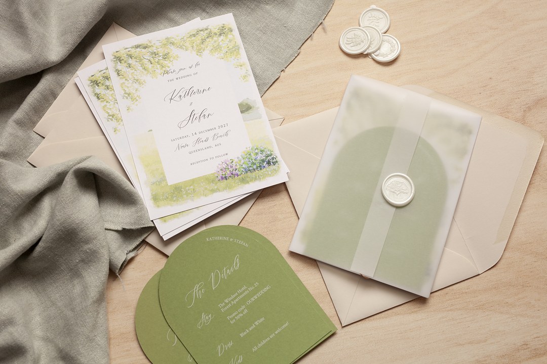
- The wedding invitation trends for 2027 favor paper you can feel, personal motifs, and deeper color over flat minimalism.
- Silver foil is rising as the default metallic, with gold still available for warm or classic palettes.
- Dark card with white ink brings formality to plum, midnight blue, burgundy, and chocolate brown.
- Shaped cards, one-hue suites, vellum layers, and a quiet QR code update the standard invitation.
- Every look maps to a print method, from letterpress and white ink to flat foil and digital.
You have the venue, the date, and a browser full of inspiration, but every set starts to blur. The big change in 2027 wedding invitation trends is that the paper itself has become the point: texture you can feel, a personal motif, and deeper color now lead the way over flat minimalism.
Makers and forecasters keep returning to three ideas: touch, story, and confident color. Each of the ten trends below tells you what the look is, who it suits, and which print method or paper actually produces it.
Treat the list as a set of directions, not a ranking. Use it to pick one or two looks you love, then match them to your season, venue, and formality.
What is driving invitation design for 2027
The 2027 wedding invitation trends all point the same way: toward paper people want to touch, stories only the two of you can tell, and color that does not hide. These are forecasts from named sources, not measured rankings, and they say more about where invitation design is heading than about what any one couple must choose.
Who What Wear’s July 2026 forecast described a turn toward intention and tactile paper, and Atilervale’s July 2026 wedding stationery trends forecast named texture the headline. Across the 2027 wedding stationery trends, the common thread is that the invitation has to feel like the first chapter, not an afterthought.
| Trend | What it looks like | Suits |
|---|---|---|
| Textured paper and letterpress | Thick cotton with a pressed, touchable impression | Garden, historic, casual-elegant |
| Silver foil | Cool metallic lines on deep or icy color | Formal evenings, winter, modern |
| Dark card with white ink | Deep-colored card with pale opaque lettering | Fall and winter, evening |
| One-hue suites | One color in layered depths across every piece | Minimalists who still want depth |
| Arches and shaped cards | Curved, scalloped, flower, or cutout silhouettes | Design-led and outdoor weddings |
| Hand-painted and line-art illustration | Painterly washes or single-line scenes | Whimsical, botanical, coastal |
| Monograms, crests and venue drawings | A repeated personal mark across the suite | Formal and story-driven couples |
| Decorative type and borders | Ornate serifs, borders, and drop caps | Storybook, classic, and grand venues |
| Vellum, liners and layers | Translucent overlays and unfolding pieces | Romantic and intimate weddings |
| QR code with a quieter card | Clean card with a code for changing details | Most weddings that gather RSVPs online |
Return to this list as a table of contents. Each section below names the forecast behind the look and the print method or paper that actually produces it.
Texture and finish
The strongest 2027 invitations are built around finish first: a sheet you want to run your thumb over, a letterpress impression you can feel, or a silver foil line that catches candlelight.
Textured paper and letterpress
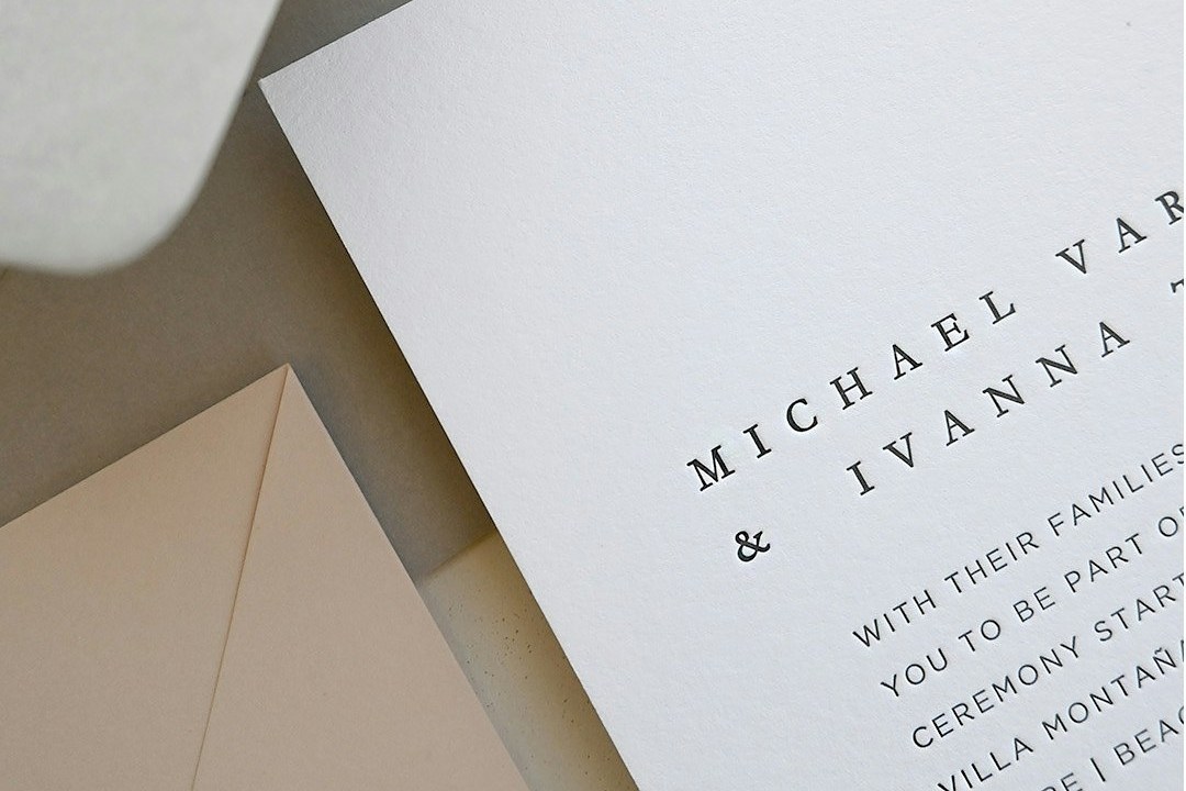
Textured paper and letterpress is the feel-first invitation: thick cotton card pressed with type so firmly that the letters leave a physical mark under your finger. A guest’s hand notices the weight before the wording, and the lettering sits just below the surface. Who What Wear’s forecast, through Sunna Yassin, owner of Bash Please, explains that tactile paper goods matter more as flat screens take over daily life.
Wezoree’s August 2026 and Studio Gail’s June 2026 forecasts make the same turn toward artisanal finishes. This look suits garden parties, historic venues, and casual-elegant weddings. Pair it with strong type, a single motif, and little else, and ask your stationer for a strong, uncluttered layout so the pressed letters stay clear.
The method is letterpress on cotton paper. Type is pressed into the sheet, leaving an impression you can feel. Browse letterpress wedding invitations to see how the impression supports bold layouts.
Silver foil in place of gold
Silver foil in place of gold is the metallic shift of the year: silver has moved from accent to default on many 2027 invitations. Atilervale’s forecast named silver overtaking gold, and The Aisle Wedding Directory’s June 2026 color report placed the same shift in stationery.
Silver sits especially well on midnight blue, charcoal, gray, lilac, and icy blue. Gold is not gone; it stays a warm option for classic, candlelit, or ivory-heavy suites. Mixed metals offer a middle path when you want a little of both. Ask for a silver sample on your chosen card, and avoid a heavy foil stamp if your type is fine script.
Two foil methods suit silver. Flat foil applies a thin metallic film to chosen parts of the design and handles fine lines and small type. Foil stamp uses a custom metal die, so it adds foil and a pressed impression, better for bold initials than hairline detail. Read flat foil versus foil stamp before choosing.

Color on the card
Color in 2027 invitations has moved from pale backgrounds to richer, more saturated stock and one-color suites with real depth.
Dark card and deep color
Dark card with deep color is exactly what it sounds like: the invitation itself is printed on a plum, midnight blue, burgundy, or chocolate brown background rather than ivory. The color reads confident from envelope to RSVP, and it suits fall and winter evenings, candlelit rooms, and formal schedules.
Slvara’s August 2026 forecast adds olive, wine, chocolate, and midnight blue, while Wezoree highlights plum. If the look says midnight blue, ask for navy card under white ink; if it says plum, violet or burgundy paper gets you there.
White ink is the cleanest way to put text on a deep sheet. Opaque white sits on colored card in navy, violet, burgundy, gray, cobalt, aqua, black, green, and kraft. Flat foil can also go on colored card for a metallic edge. See white ink invitation designs for how dark paper and pale lettering read in person.
One-hue suites
A one-hue suite is color-drenched in a single color layered at different depths: the deepest shade on the envelope, a lighter liner, the palest tint on the card, and ink one step darker than the card. WeddingDecor.com’s July 2026 palette forecast named color drenching the styling technique of the year, and Atilervale described the same layered approach.
For a blue suite, that might run from deep navy envelope to pale blue card with navy ink. Single-hue is easier than a two-color scheme because every piece belongs to the same family. If you prefer two tones, layered pastels are the close alternative: light for backgrounds and deep for type, such as lavender with plum, powder blue with slate, blush with mocha, or mint with olive. Ask for a sample before ordering because pale tints can shift on textured stock.
Once you settle on an invitation color, pull it through the rest of the day with the ten forecast palettes in wedding colors for 2027, grouped deep and moody, bright and confident, and soft and garden.
Shapes with a reason
Arches, curves, scallops, flower shapes, and small cutouts are giving the 2027 invitation a silhouette rather than a standard rectangle. The Wed’s September 2026 forecast named hole-punch cutouts such as small stars, circles, and abstract shapes. Slvara’s report said a shape needs a reason: a leaf-like curve for a botanical suite, or an architectural detail from the venue.
This is the rule to carry into your meeting with a stationer: every curve should connect to the place, the flowers, or a motif you already love. Before you commit, check that the shaped card will fit a standard envelope you like and ask how it will travel through the mail. A standard rectangle is not a failure, but one purposeful curve can make the whole suite feel designed. Browse arch-shaped die-cut invitations to see the silhouette at work.
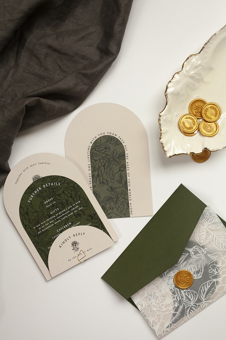
Illustration and personal motifs
The most personal 2027 invitations read like a small gallery of your relationship, with illustration and a repeated motif doing the talking.
Hand-painted and line-art illustration
Hand-painted and line-art illustration puts painterly washes, watercolor florals, or a single-line drawing of the two of you directly on the invitation. The Wed’s forecast described hand-painted suites with watercolor and hand-drawn motifs, and Wezoree’s forecast highlighted single-line drawings of a couple, a pet, or the venue.
Imagine a watercolor of the greenhouse where you got engaged, or a line drawing of the black lab who greets guests at your door. Keep the typeface clean so the illustration leads, and reuse one drawing across save the dates, invitations, and signs. Ask your stationer to prepare the same artwork at different scales before you order menus and place cards. This look suits botanical, coastal, and whimsical weddings.
Monograms, crests and venue drawings
A monogram, crest, or venue drawing is a repeated personal mark that opens the story on the envelope and carries it through the reception. Who What Wear’s forecast described suites built on a personal narrative, where a pattern from a shared trip or a shared hobby becomes a thread. Slvara’s report said monograms, crests, and venue drawings work as one wedding identity.
This motif suits couples who want formality and a clear sense of place. Keep the mark to one or two colors so it repeats cleanly on signs, menus, and the outer envelope. Start with wedding monogram or crest ideas before you settle on one mark.
Ornament and layers
Ornament and layers give 2027 invitations a considered, almost book-like feel without adding clutter, as long as you keep one clear focal point.
Decorative type and borders
Decorative type and borders bring storybook ornament back: ornamental serifs, illuminated initials, ornate borders, and drop caps in careful doses. Atilervale describes this as one ornamental element per suite, and Studio Gail’s forecast names whimsy and storybook detail in place of neutral minimalism.
The rule is one ornament at a time. A drop cap plus an ornate border and a decorative serif can argue; a single border or illuminated initial stays confident. Use it for the names, then let the remaining type fall back to something quieter. Read wedding invitation typefaces to find that mix.
Vellum, liners and layers
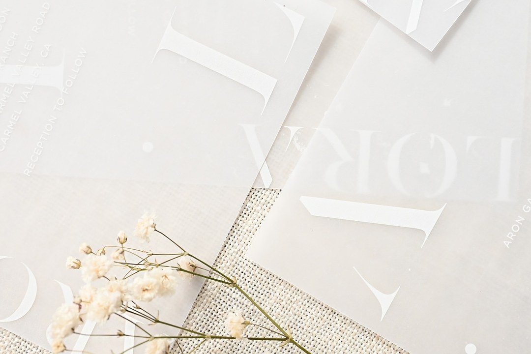
Vellum, liners, and layers turn a flat card into a small object that unfolds. The Wed’s forecast named interactive stationery with pieces that spin, slide, unfold, or reveal hidden layers. Stationer Mia Birchall of Theresa Paperie makes the point that combining several paper textures, a fold, or a hidden detail can read as considered without driving the cost up much.
Layers feel expensive because they slow the reader down, not because they require heavy ornament. Start with translucent vellum and a lined envelope. If the budget is tight, ask for one hidden layer, such as a vellum wrap or a patterned liner, rather than several moving pieces. Browse vellum wedding invitations to see how overlays change the color beneath.
Print and digital together
The 2027 invitation handles two jobs: paper carries the feeling and the fixed facts, while a QR code or website address carries the details that change. Slvara’s forecast framed it exactly that way, with the stationery holding the emotional open and the wedding website holding current information.
What belongs on the card: your names, the date, the city, the venue, and the time. What belongs online: RSVP forms, meal choices, dietary notes, hotel blocks, transport updates, and any last-minute changes. That keeps the card calm and the information current.
A QR code does not have to look stuck on. Place it on the reverse or on a details card, frame it with a thin line, or tuck it beside the return address. Use the guide on QR code invitation design for placement that matches the suite.
What is fading
Textureless minimalism and default gold are the two biggest looks stepping back for 2027, though none of the fading trends is wrong. Wezoree’s forecast and Atilervale’s report both make the point: flat minimalism survives when it gains one tactile or tonal layer, and a simple layout still works if a finish or color depth gives it weight.
Here are the shift points to watch:
- Minimalism with no texture is being replaced by minimalism with cotton, embossing, or a vellum layer.
- Gold by default is giving way to silver first, with gold kept as a deliberate warm choice.
- Foil alone on smooth card now reads unfinished unless the card or type has texture to support it.
- Symmetrical floral borders are stepping aside for hand-painted motifs, arches, and ornamental frames with more irregularity.
- The blush and sage pairing is yielding to plum, mocha, olive, midnight blue, and layered pastels.
- Terracotta everywhere is loosening into chocolate, wine, and fall burgundy.
If you love a simple layout, keep it. Add one deep tone or one soft cotton sheet and it will feel current.
How to choose your invitation look
Choose one headline trend and one supporting trend, then match both to your venue, season, and formality. Atilervale puts the same advice plainly: trends belong on accents, while a classic layout supplies the structure.
Lead with the idea that carries the biggest feeling. A black-tie evening may lead with silver foil on navy. A spring garden may lead with hand-painted flowers. Let the supporting trend stay quieter: a vellum overlay, a monogram, or a scalloped edge. The standard invitation card stays 5 by 7 inches, or 178 by 127 millimeters, in both Australia and the United States, but the seasons run opposite. Spring in Australia is September to November and summer is December to February, so choose your palette by your own season, not by a northern hemisphere month.
As you look at trending wedding invitations, browse the full wedding invitation catalog at Paperlust to see the designs together.
| Your wedding | Lead with | Print method and paper |
|---|---|---|
| Black-tie evening | Silver foil on navy | Flat foil on navy card |
| Garden or spring | Hand-painted flowers | Digital on cotton or matte paper |
| Coastal or destination | One-hue blue suite | White ink or flat foil on aqua card |
| Fall vineyard or barn | Textured paper and letterpress | Letterpress on cotton paper |
| Modern city | Arch and die-cut shape | White ink or flat foil with custom die cut |
| Small and casual | Vellum layer and line illustration | Digital with vellum overlay |
Browse the wedding invitation designs behind these 2027 looks →
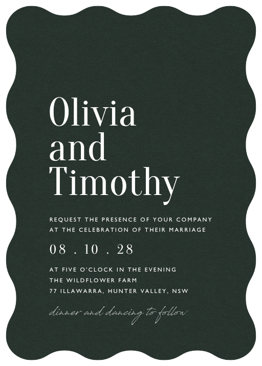
StatementWhite ink
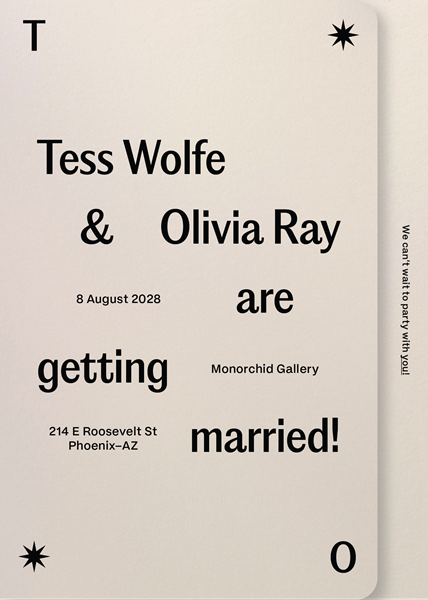
ArizonaDigital printing
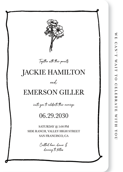
Love Is BloomingDigital printing
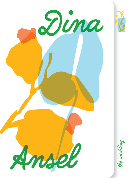
LimoncelloDigital printing
How these looks get printed
Every 2027 look maps to a specific method. Letterpress creates the deepest texture, flat foil handles silver and fine lines, foil stamp suits bold monograms, white ink fills dark card, and digital carries full-color illustration.
Paper sets the ceiling for each method. Letterpress is pressed into soft cotton paper only. Flat foil places a metallic film on chosen parts of the design, on smooth or colored card. Foil stamp uses a custom die for foil plus a pressed impression. White ink is opaque white on dark or colored card, and digital is the natural home for painted and illustrated art. Custom die-cut shapes such as arches are available across several methods.
At Paperlust, you personalize the design online. A designer then prepares a free digital proof, and the first proof is ready 1 to 2 business days after your order. Production proceeds only after you approve that proof.
Letterpress and foil stamp require a minimum of 50 invitations. White ink, flat foil, and digital start at 10. A sample pack lets you compare paper and print examples before choosing.
Each design carries through the day with matching ceremony programs, menus, place cards, and thank you cards, and the set goes further from there. Paperlust designs are created by independent artists, printed in Melbourne, Australia, and delivered internationally. If a bold monogram is your lead, browse foil stamped wedding invitations.
Beyond the printed suite, the same look can guide signs, tables, lighting, and food, and the twelve forecasts in wedding trends 2027 cover those day-of choices in the order a guest meets them.
Frequently asked questions
What are the biggest wedding invitation trends for 2027?
The biggest wedding invitation trends for 2027 are textured cotton paper with letterpress, silver foil in place of gold, dark card with white ink, one-hue suites, shaped arches and cutouts, and vellum layers. These forecasts emphasize touch, personal motifs, and richer color. For most couples, the workable version is one headline look, such as textured letterpress, plus one supporting element, like a translucent vellum band or liner.
Is gold foil out for 2027?
Gold is not out. It has simply stopped being the automatic metallic choice. Silver is moving ahead on deep blues, charcoal, gray, and icy pastels, but gold still suits warm ivory, classic candlelit, and fall palettes. Mixed metals give you a middle path when neither alone feels right. If you love gold, keep it intentional with a warm or formal palette.
Which wedding invitation colors are current for 2027?
For 2027, the strongest invitation colors are midnight blue, cobalt, plum, blackberry, burgundy, chocolate and mocha brown, olive, and wine. Dark stock works especially well with white ink or silver foil. Pastels return as pairs of pale and deep tones: the light shade sits in the background and the deeper shade carries the type.
Is a QR code acceptable on a formal invitation?
Yes, if it is placed discreetly. Put the ceremony details on the formal invitation, and tuck the code on the reverse, on a details card, or beneath your website address. A thin frame or matching ink helps it feel designed. The paper carries the emotional open and the fixed facts; online handles RSVPs, meal choices, and changing guest information.
Are minimalist invitations out?
Flat, textureless minimalism is fading, but minimal invitations are not out. The 2027 version adds one tactile or tonal layer: a soft cotton sheet, a letterpress impression, a darker ink, or a vellum wrap. Keep the layout clean and let the paper or a single finish do the work. That keeps the calm you like and updates the look.
Which invitation print method has the deepest texture?
Letterpress gives the deepest texture because it presses type into soft cotton paper, leaving an impression a fingertip can feel. Foil stamp adds foil and a pressed impression through a custom metal die, so it works best for bold lettering and monograms. Flat foil places a metallic film only on selected areas, which suits fine lines and small type.
How many trends can one suite carry?
One headline trend plus one supporting trend is the sweet spot. Lead with something like silver foil on navy or hand-painted florals, then add a quieter layer such as a vellum wrap, a monogram, or a scalloped edge. More than that competes for attention. Keep the layout classic for structure, and let the two chosen details carry the personality.