
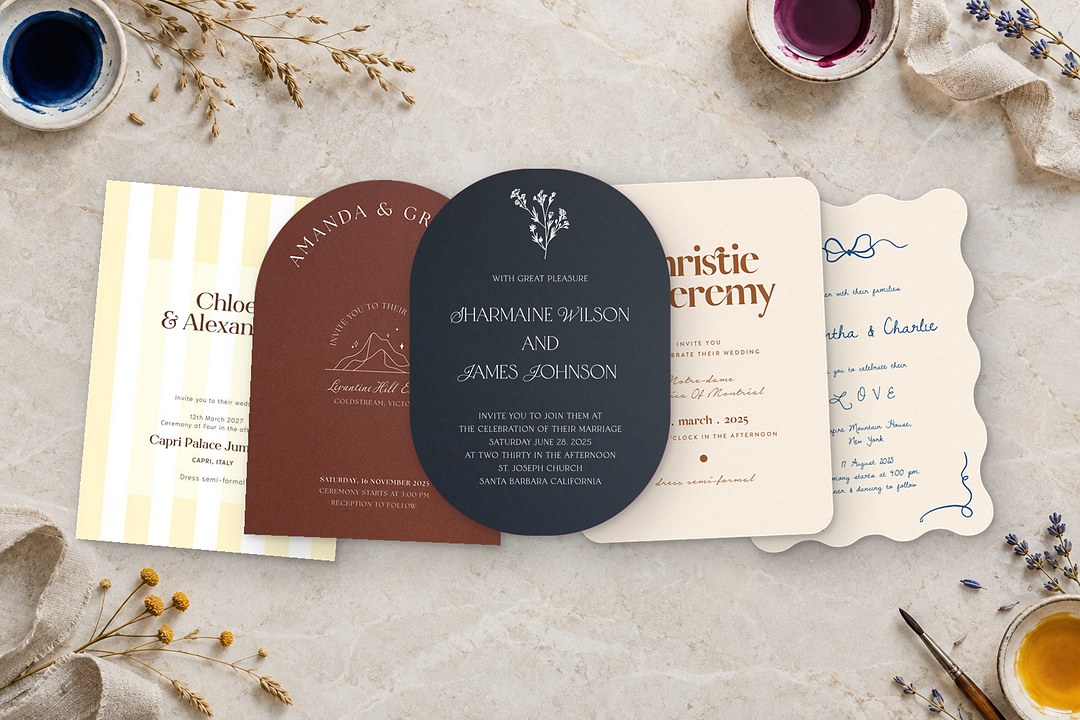
- Wedding colors 2027 are layered and tonal, with no single shade ruling the forecast.
- Luminous Blue from WGSN and Coloro points toward cobalt and sky blue in spring and summer palettes.
- Silver overtakes gold as the default metallic and sits beside midnight blue, burgundy, and emerald.
- Espresso, plum, and burgundy anchor deep palettes for fall, winter, vineyards, and candlelit rooms.
- Pale pastels need a printed sample first because light tints can shift on textured paper.
You have the venue deposit down, a photographer shortlist ready, and a florist asking whether the napkins should lean blue or brown. The palettes you saved online stop at table linens, and they do not show you how a deep brown invitation will look on card stock or whether a powder blue save the date will disappear under gold lettering. You need wedding colors for 2027 that work beyond the mood board.
This guide gathers ten palettes from 2026 forecasts, names the publications behind them, and walks through how each one prints on an invitation. It also maps the palettes to season and setting, covers silver and gold, and ends with a clear way to choose a scheme without chasing exact matches.
What is different for 2027
The wedding color trends for 2027 point in one direction: no single color rules, and palettes feel layered and tonal. The Aisle Wedding Directory reported in June 2026 that couples are growing comfortable with bolder color, and Gather at the Lakes made the same call in September 2026. These are forecasts, not measured rankings, so treat them as a starting point rather than a rulebook.
WGSN and Coloro named Luminous Blue as the cross-industry Color of the Year for 2027, a vivid blue compared to lapis lazuli or cobalt. That blue points in the same direction as the cobalt already rising in wedding forecasts, but it is not a wedding-specific rule. At the same time, silver is replacing gold as the default metallic, especially next to midnight blue, charcoal, blackberry, emerald, and burgundy. Gold remains in use, and many couples mix both.
The ten palettes at a glance
No single wedding color palette sums up the year, so the clearest way to compare the ten options is by mood: deep, bright, and soft. The table below lists each one with the setting it suits and the print method that usually carries it best.
| Palette | Colors | Season or setting | Prints best as |
|---|---|---|---|
| Espresso neutral | Deep brown, latte, caramel, ivory | Barn, vineyard, estate; fall and winter | Brown digital on linen or white ink on kraft |
| Midnight blue and silver | Midnight blue, silver, ice white, champagne | Ballroom, rooftop, evening; fall, winter | White ink on navy with silver foil |
| Plum and lavender | Deep plum, aubergine, blackberry, lavender | Evening, vineyard, historic venue | White ink on violet with gold or silver foil |
| Burgundy and berry | Burgundy, berry, deep red, blush, cream | Candlelit rooms; fall and winter | White ink or silver foil on burgundy card |
| Cobalt and warm cream | Cobalt, warm cream, sky blue, warm gold | Villa, ballroom, summer; spring, summer | White ink on cobalt card or digital on linen |
| Butter yellow with olive | Butter yellow, olive, caramel, champagne | Spring, summer, early fall | Digital on matte or soft cotton |
| Bold pink, orange and chartreuse | Bold pink, orange, chartreuse | Summer, destination, garden party | Full-color digital or colored foil |
| Garden pink and green | Pastel pink, grassy green, white | Garden, greenhouse; spring | Watercolor digital on soft cotton |
| Powder blue and soft yellow | Powder blue, misty blue, soft yellow | Spring and outdoor | Digital on linen or letterpress on cotton |
| Olive, moss and cream | Olive, moss, eucalyptus, forest, cream | Every season | Digital on matte or white ink on green card |
Deep and moody palettes
Deep palettes for 2027 lean into espresso, midnight, plum, and burgundy, and they rely on white ink or metallic foil to stay legible. These are the palettes that glow in evening light and tucked-away venues.
Espresso neutral
The reason espresso is rising is that brown works as a warmer, deeper neutral base in place of white and cream. Green Wedding Shoes named the mood Espresso Neutral in August 2026 and points to near-black brown against pale oat and cream for contrast. The palette runs deep brown, iced coffee or latte, caramel, and ivory, and it suits a barn, vineyard, or historic estate in fall and winter. For print, use warm brown text on linen or soft cotton paper, or choose white ink on kraft card.
Pair it with dusty rose, champagne, or muted gold. Let ivory carry the invitation ground rather than bright white, which can feel too crisp against the brown.
Midnight blue and silver
WeddingDecor.com lists midnight blue and silver as new for 2027 in a July 2026 update. Atilervale, also in July 2026, adds the reason: midnight blue carries the formality of black but feels warmer. The colors are midnight blue, silver, ice white, and champagne. It is made for a ballroom, rooftop, or historic mansion at night, in fall or winter. On paper, white ink on navy card keeps the text crisp, and silver foil does the finishing work. For a lighter option, bring in sky blue or let champagne lead.
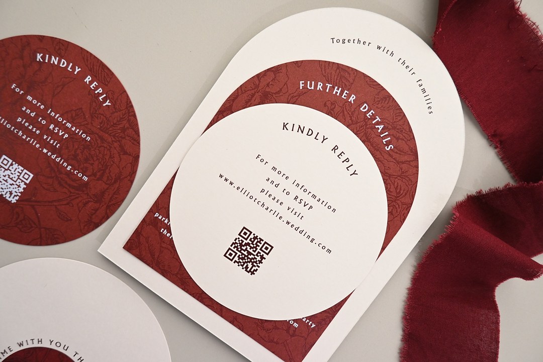
Browse white ink wedding invitations on dark card for palettes that need a dark ground.
Plum and lavender
Wezoree, in August 2026, says berry tones are taking over from the softer pinks of recent seasons, and keeping one element light stops the palette from turning heavy. That is the logic behind plum and lavender: deep plum, aubergine, and blackberry lifted by lavender or lilac, then lightened further with blush, mauve, or ivory. It is natural for evening, vineyard, and historic weddings in fall and winter. Print the dark note on violet card with white ink, and use a lavender liner or ivory backer for the lighter pieces.
Burgundy and berry
Burgundy and berry brings burgundy, berry, deep red, soft blush, and cream. Who What Wear and florist Katie Wachowiak reported in July 2026 that rich browns and deep reds continue to hold while lilac and pastel blue appear as softer accents. That gives the palette a natural way to stay current and still lighten the room. Pair the heavy red with soft blush and cream in the flowers, and add silver as a cool accent on the invitations or table numbers. White ink on burgundy card protects the depth, and silver foil reads crisp against the red.
For more dark gem tones and the same card-and-foil logic, read our jewel-tone wedding palettes article.

Bright and confident palettes
The bright palettes for 2027 take their energy from cobalt, butter yellow, and strong pinks. They print best with full-color digital work or bold foil accents, and they suit daylight and rooms that can handle high contrast.
Cobalt and warm cream
Cobalt and warm cream runs cobalt, warm cream, sky blue, and warm gold, with butter yellow as a lift. WeddingDecor.com lists it as new for 2027, and it fits a villa, ballroom, or summer outdoor celebration in spring and summer. Luminous Blue points in the same direction as that cobalt. For paper, choose white ink on cobalt card for a saturated look, or print the blue as full-color digital on matte or linen paper. Use warm cream rather than stark white for the text or envelope to keep the blue from feeling cold.
Butter yellow with olive
The Aisle Wedding Directory explains that butter yellow carried over from earlier seasons, and the change for 2027 is richer companions in place of plain white. The palette is butter yellow, olive green, caramel, and champagne, with dusty blue or warm taupe stepping in for white. It works in spring, summer, and early fall. Print this on matte or lightly textured linen so the yellow stays soft rather than loud. Pair it with caramel details and natural wood accents to keep the olive from reading too uniform.
Bold pink, orange and chartreuse
Bold pink, orange, and chartreuse is the loudest 2027 option. Green Wedding Shoes reads it as a reaction to years of neutral palettes, while The Aisle Wedding Directory points to coral and persimmon as nearby summer tones. The palette works for summer, destination, or garden party weddings where the setting is already bright. Full-color digital handles the three-color clash best, while a hot pink or orange foil can mark the envelope or the couple’s names. Soften the table with peach, ivory, or blush so the invitation remains the brightest point.
Soft and garden palettes
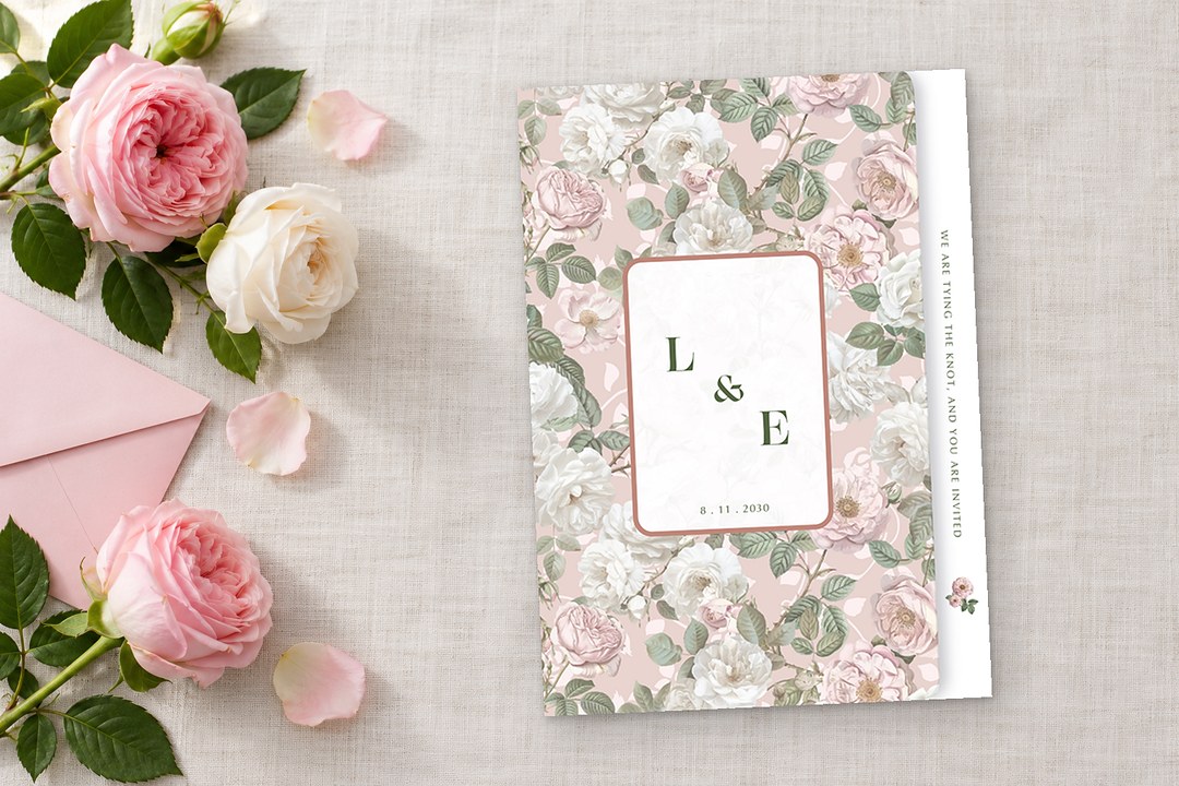
The garden palettes use pink, blue, green, and cream with a lighter hand, and they are the group where a printed sample matters most. Atilervale cautions that pale tints shift on textured paper, so check the lightest colors on a real sample before you commit.
Garden pink and green
Garden pink and green combines pastel or powder pink, grassy or spring green, and white. Green Wedding Shoes sees pink as fresh, not sweet, when set against a vivid green. It belongs in a garden or greenhouse, mostly in spring. Print it as a watercolor full-color design on soft cotton, and choose a deeper green for body text so the wording stays readable.
For softer blooms that suit this palette, see floral and watercolor wedding invitation designs.
Powder blue and soft yellow
Powder blue and soft yellow mixes powder blue, misty blue, and soft yellow. Green Wedding Shoes includes it under Quiet Color, describing the blue as soft enough to act as a neutral. It suits spring and outdoor weddings, with a coastal version of slate, misty blue-gray, and sandy neutrals for water views. Digital on linen keeps the blue light, and letterpress on cotton adds texture.
The lightest tints shift on textured stock, so order a sample and hold it in natural light before you approve a powder blue invitation.
Olive, moss and cream
Olive, moss, and cream uses olive, moss, eucalyptus, and forest green against cream or champagne. Kennedy Blue’s August 2026 bridesmaid dress color forecast listed moss green, olive green, and forest green among its ten colors, and the palette works in every season because the greens can move toward yellow or blue. Print the greens digitally on matte or linen, or use white ink on green card. Pick one accent from lavender, terracotta, or deep gold and repeat it on the save the date and menu.
Metallics
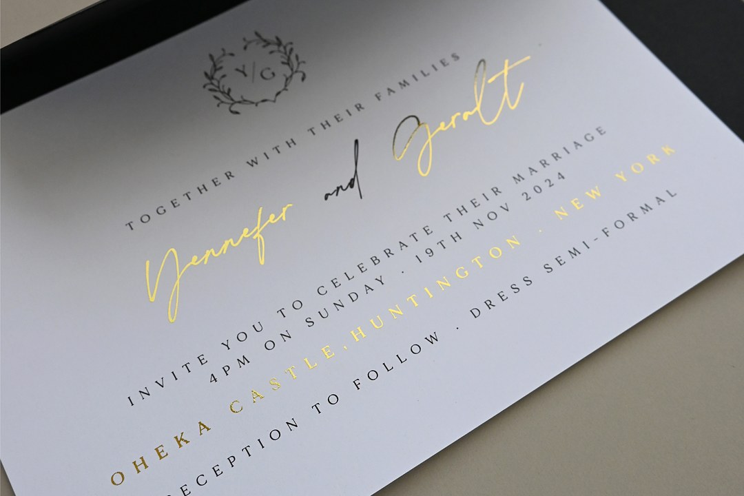
Silver is taking over as the default metallic for 2027 while gold becomes a choice rather than an automatic finish. WeddingDecor.com and Atilervale both report silver moving forward through the forecasts. Silver sits naturally beside midnight blue, charcoal, dusty blue, blackberry, emerald, and burgundy.
You can see how that silver finish carries onto the reception in the wedding trends forecast, where candelabras and serving trays pick it up beside chocolate brown, plum and midnight blue.
Gold still belongs in warm palettes: espresso brown, butter yellow, champagne, and ivory. Many couples mix both, with silver on the invitation wording and a gold touch on the wax seal or table number. Copper blends best with moody mauve in fall. A metallic should finish a monogram, border, or return address rather than act as a third full color, so it catches light without competing with the anchor.
On paper, foil is a reflective layer that changes with the light, while pearlescent metallic paper gives a softer all-over sheen. Flat foil on colored card keeps dark palettes crisp.
How each palette prints on an invitation
The print choice should follow the palette, not fight it. With Paperlust you can approve the wording, layout, and placement of every color in a free digital proof before the press run. That proof stays on screen, so use it to check text, spacing, and which colors sit where. It arrives 1 to 2 business days after you order, and nothing is printed until you approve it. To judge a tint or foil on real paper, order a sample pack instead.
Here is how the 2027 palettes translate to paper:
- Dark palettes: espresso brown, midnight blue, plum, and burgundy suit white ink on dark or colored card. The card options include cobalt, aqua, black, navy, green, violet, burgundy, gray, and warm kraft, with vellum as a translucent choice. White ink and flat foil both begin at 10 invitations.
- Metallic accents: flat foil comes in gold, pale gold, rose gold, silver, copper, holographic, and bold colors such as red, green, blue, and hot pink. Foil stamp uses a custom metal die and adds a pressed impression for bold lettering or monograms; it starts at 50 invitations.
- Soft tints and multi-color palettes: garden pinks, powder blue, butter yellow, cobalt, and bright pink usually print best as full-color digital on matte, linen, or soft cotton paper. Digital runs begin at 10 invitations.
- Texture: letterpress is pressed into Wild Cotton paper only and leaves an impression you can feel with a fingertip. Use it for olive and cream, powder blue with slate, or any palette where the paper is part of the design. Letterpress starts at 50 invitations.
- One exception: white ink is not used on blush paper. If you want a blush ground, choose digital print or foil instead.
Paper choices vary by design and include smooth Matte, lightly textured Linen, pearlescent Metallic, soft Wild Cotton, translucent Vellum, and Matte Double T, the thickest. Before you approve a pale pink or soft yellow, order a sample pack of paper and print examples so you can check the tint on the actual stock. Your order is printed in Melbourne, Australia and delivered internationally. A design can be carried across matching save the dates and menus, so the palette stays consistent without extra matching work. Paperlust includes white envelopes, with colored envelopes and liners available as upgrades.
The palette is only one side of the choice, and the ten looks in wedding invitation trends 2027 show the print method behind each one, from textured cotton paper with letterpress to silver foil, dark card with white ink, shaped cards, and vellum layers.
Browse the full wedding invitation catalog to see the designs.
Browse wedding invitation designs in every palette →
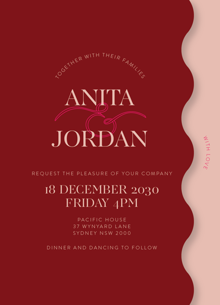
Red VelvetDigital printing
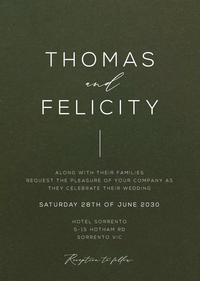
VerdeWhite ink

Fifth AvenueDigital printing
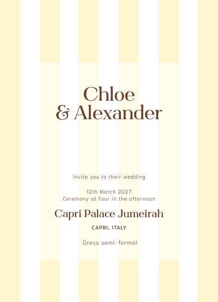
Vintage StripeDigital printing
Palettes by season
Season changes the light, the flowers, and the way a color reads in a room, so it is a useful filter before you settle on a palette. Fall wedding colors for 2027 lean into the dusky end of the spectrum, while spring wedding colors and summer wedding colors favor clear, light, and bright combinations. The table below summarizes the best fits.
For readers in Australia, the seasons run opposite: fall is March to May and spring is September to November.
| Season | Palettes that suit it | Why |
|---|---|---|
| Spring | Garden pink, powder blue, butter yellow, cobalt | Fresh green and blue under soft spring light |
| Summer | Cobalt and cream, bold pink, orange, butter yellow, olive | Strong color holds up in bright daylight |
| Fall | Espresso, plum, burgundy, mauve with copper, olive | Deep anchors suit shorter days and warm candlelight |
| Winter | Midnight blue, burgundy, espresso, plum | Cool dark card reads formal in low evening light |
Silver works in both halves of the year, which makes it the easiest metallic to carry from a June invitation to a December menu. For more examples, see wedding color schemes for every season. Our fall wedding color palettes article looks closer at autumn.
How to choose your palette
Start with the venue, the season, and the light, because those set the boundaries for everything else. Strong wedding color schemes are not built from an exact matching set but from a family of shades around a few core colors.
- Name one anchor color from the palette you like, then choose two or three supporting tones and one or two accents. WeddingDecor.com suggests this shape, and Wezoree describes a similar plan of one main color, one neutral, one accent, and a metallic as the finishing touch.
- Follow the venue before the forecast. A cobalt and cream palette can work in a bright villa but may feel cold in a wood-paneled winter ballroom. Let the room’s natural light and finishes lead.
- Use shades, not exact matches. Gather at the Lakes advises that colors need not match perfectly; close tones of a few core colors often look more layered and intentional than identical linen, ink, and ribbon matches.
- Place the invitation first. It is the first piece guests see, and it sets the palette before the florals or table arrive. Choose paper and print that can hold the anchor color, then let the day-of pieces follow.
- Borrow trends for accents, not for the anchor. A butter yellow trend can appear on a menu or envelope liner while your favorite deep green anchors the suite. That keeps the palette personal and current at the same time.
If you want a longer step-by-step walkthrough, read our guide to building a wedding color palette.
Frequently asked questions
What are the wedding colors 2027 forecasters mention most?
The most mentioned wedding colors for 2027 are midnight blue, espresso brown, burgundy, plum, butter yellow, cobalt, and olive. Silver appears as the leading metallic rather than a color itself. None of these is the single ruling shade; forecasters describe the year as layered and tonal, with a deep anchor and one or two bright accents. Luminous Blue points toward cobalt accents, but the wedding palettes remain broader than that one blue.
What is the color of the year for 2027?
Luminous Blue is WGSN and Coloro’s Color of the Year for 2027. They describe it as vivid, with a comparison to lapis lazuli and cobalt. It is a cross-industry forecast, not a wedding-specific one, so treat it as an accent or supporting blue in a wedding suite rather than the entire palette.
Is silver or gold better for a 2027 wedding?
Silver is the default metallic for 2027, according to several forecasts. It suits midnight blue, charcoal, blackberry, emerald, burgundy, and dusty blue. Gold still works well with espresso, butter yellow, champagne, and warm neutrals, and many couples mix both. Use one metal as the main finish and the other for a small detail like a monogram or wax seal.
What are the best fall wedding colors for 2027?
For 2027 fall weddings, the strongest palettes are espresso neutral with caramel and ivory, plum and lavender, burgundy and berry, and moody mauve with copper. Olive and moss also works through fall. These palettes suit barns, vineyards, historic estates, and candlelit rooms. White ink or foil on dark card carries them well on invitations, and silver gives them a cooler alternative to gold.
What are the best spring and summer wedding colors for 2027?
Spring 2027 leans garden pink and green, powder blue and soft yellow, butter yellow with olive, and cobalt with warm cream. Summer can hold the brighter versions: cobalt and cream, bold pink with orange and chartreuse, and butter yellow with olive. Keep spring airy with pastel grounds, and let summer invitations use more saturated fields or bold colored foil.
Are sage green and terracotta out for 2027 weddings?
Sage is not out, but deeper greens such as olive, moss, eucalyptus, and forest are rising. Terracotta is in transition. Wezoree reports it continuing in a richer layered form, while Atilervale says the terracotta-everywhere look is fading. If you love terracotta, use it as one accent inside an olive, moss, or cream palette rather than as the main color.
How many colors should a wedding palette have?
A 2027 wedding palette usually lands between four and six colors before the metallic finishing layer. That total covers the anchor plus the supporting tones and accents in the forecasters’ formulas, with the metal kept outside the count as a final touch. If the palette starts to feel busy, remove one supporting tone first; the anchor and one accent can still hold the scheme.
Do invitations have to match the wedding palette exactly?
No, the invitation does not need to match exactly. Gather at the Lakes advises working in shades and tones of a few core colors rather than forcing identical matches across every item. Tints can also shift on textured paper, so check light colors on a printed sample first. The invitation should introduce the palette, but the day-of details can move a step lighter or deeper.