
If you’ve ever dreamed of a Taylor Swift wedding, you’re not alone. The queen of storytelling through music has inspired everything from bridal looks to event themes, and now wedding invitations too. Each Taylor Swift album represents a distinct era, mood, and aesthetic that translates beautifully into stationery design. Whether you’re a Lover, a Reputation rebel, or a Folklore romantic, this guide covers all twelve eras from the 2006 debut through to The Life of a Showgirl, with real stationery specs for each.
| Era | Year | Stationery Mood | Ideal Print Method |
|---|---|---|---|
| Debut | 2006 | Country romance, soft florals | Digital, matte or linen |
| Fearless | 2008 | Golden fairytale, champagne warmth | Flat foil in gold on ivory |
| Speak Now | 2010 | Theatrical purple, storybook drama | White ink on color stock |
| Red | 2012 | Autumn passion, bold contrast | Digital on matte or kraft |
| 1989 | 2014 | Clean pop, architectural cool | Flat foil in silver or metallic |
| Reputation | 2017 | Dark glamour, stark contrast | Foil stamp on dark color stock |
| Lover | 2019 | Pastel dream, maximalist joy | Digital on blush or color stock |
| Folklore | 2020 | Muted woodland romance | Letterpress on Wild Cotton |
| Evermore | 2020 | Autumnal nostalgia, wistful | Letterpress or metallic |
| Midnights | 2022 | Deep blue glamour, intimate | Flat foil silver or celestial blue |
| TTPD | 2024 | Typewriter-stark, confessional | Letterpress on Wild Cotton |
| The Life of a Showgirl | 2025 | Vibrant theatrical, mirror-bright | Color stock with foil |
Taylor Swift (2006): The Debut Era
Taylor’s debut album is pure country romance: wide-eyed, sun-drenched, and full of hand-tied bouquets and porch-swing afternoons. For couples drawn to this era, the stationery should feel personal and unhurried rather than polished or high-production.
Stationery specs
- Palette: Ivory, pale blue, meadow green, soft yellow
- Typographic register: Delicate serif or hand-drawn script; light weights; nothing too refined or corporate
- Print method: Digital print on 300gsm matte or linen stock; this aesthetic doesn’t need foil to land
- Paper weight: Standard matte is ideal; the warmth comes from the design, not the stock weight
- Envelope treatment: Pale blue or sage green envelope; simple wildflower or botanical liner; twine or a pressed flower as the closure
Browse the full wedding invitation collection and filter by soft floral and script styles to find designs that match this early-era warmth.
Fearless (2008): Golden Romance
Fearless is Taylor’s most optimistic album: golden light, wide-open fields, the feeling that the best thing hasn’t happened yet. For couples inspired by this era, stationery should feel warm and sun-drenched rather than formal, champagne gold rather than mirror-bright.
Stationery specs
- Palette: Champagne gold, honey ivory, warm cream, soft blush
- Typographic register: Classic romantic serif with curling flourishes; gold ink lettering; hopeful and light, not heavy
- Print method: Flat foil in gold or pale gold on 380gsm premium or 300gsm matte stock; flat foil gives the mirror-bright warmth without the custom die cost of foil stamp
- Paper weight: 380gsm premium is the right weight for an era that feels substantial and celebratory
- Envelope treatment: Champagne envelope with a gold flat foil liner; or ivory envelope with a pressed-flower illustration liner
Browse foil wedding invitations and filter by gold and pale gold for the Fearless aesthetic.
Speak Now (2010): Enchanted Drama
Speak Now is theatrical in a way Fearless never quite is, deep purples, silver, a couture dress, a storybook ending that’s earned rather than assumed. Wedding stationery for this era should feel grand without being cold: velvet and candlelight, not nightclub glamour.
Stationery specs
- Palette: Violet, deep purple, charcoal, silver
- Typographic register: Elegant display serif or dramatic script; theatrical capital letters; a hint of old-world ceremony
- Print method: White ink on 300gsm violet or navy color stock; or digital print paired with a vellum wrap for a layered, candlelit effect
- Paper weight: 300gsm color stock; heavy enough to feel special, color-saturated for the purple palette
- Envelope treatment: Deep purple or navy envelope with a silver foil liner; wax seal in violet or pewter
Browse wedding invitation styles, filter by color stock and deep tones to find designs that match the Speak Now palette.
Red (2012)
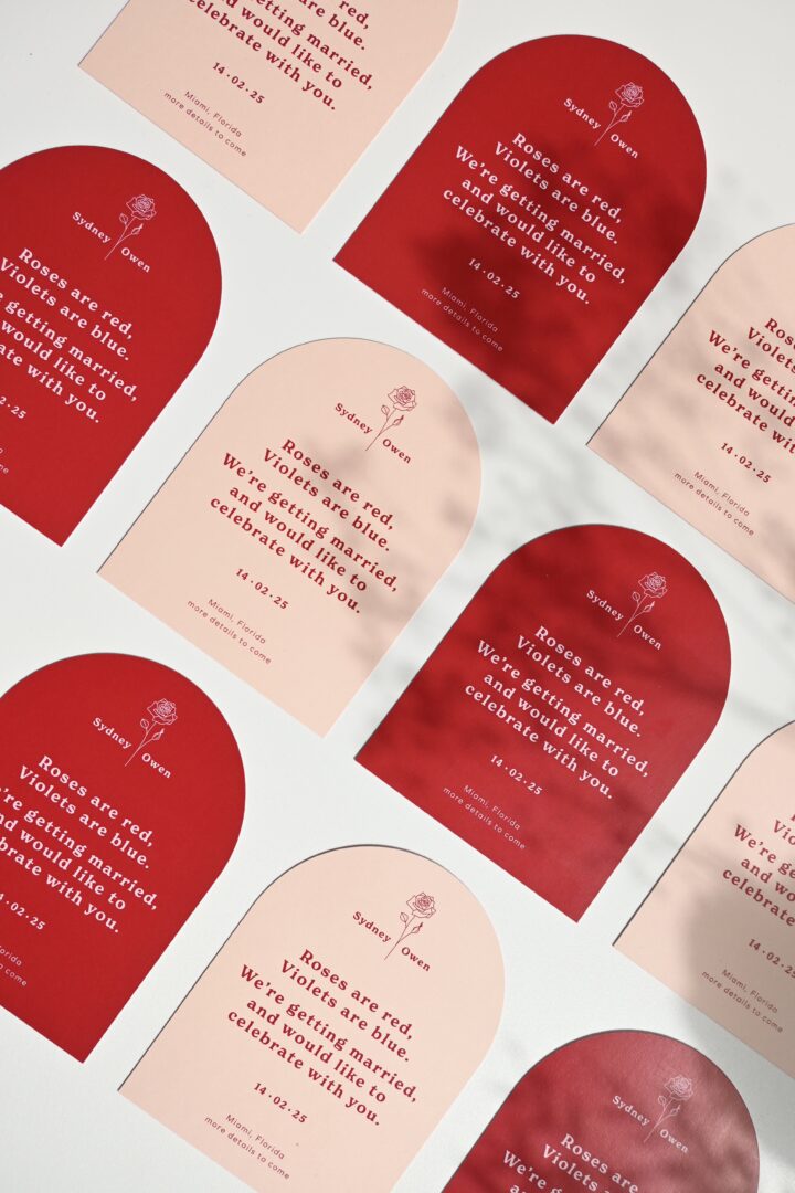
Red represents the intensity of love: passionate, emotional, and full of life. Deep reds, burgundy florals, and autumn palettes define this era’s aesthetic. Modern wedding invitations with strong color contrasts and confident typography suit this era best. The Array Invitations mirror that warmth and energy, making them perfect for couples who love a little drama and romance in equal measure.
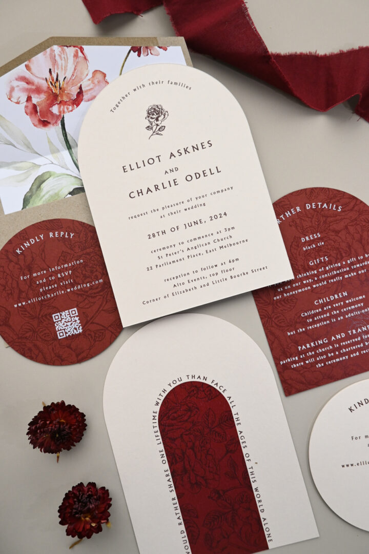

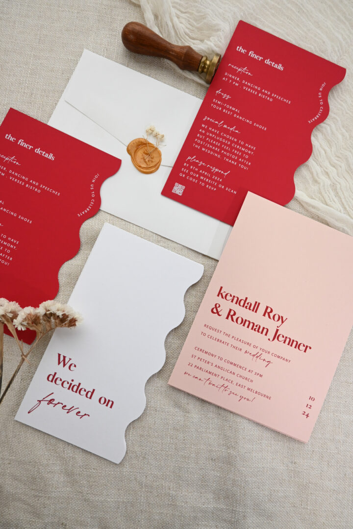
Stationery specs
- Palette: Deep crimson, burgundy, burnt sienna, autumn ivory
- Typographic register: Bold modern serif with strong contrast; confidence over delicacy; nothing whimsical
- Print method: Digital print on 300gsm matte or 290gsm kraft for texture; or flat foil in red on premium stock for added drama
- Paper weight: 300gsm matte keeps it grounded; kraft adds warmth and rustic edge
- Envelope treatment: Burgundy or rust-toned envelope; deep red liner; or kraft envelope for earthy autumn warmth
1989 (2014): Clean and Polished
1989 is Taylor’s pop reinvention: clean lines, architectural confidence, a palette of sky blue and crisp white. Where earlier eras told stories with decoration, this one lets the shapes speak. Wedding stationery for this era is pared-down and sharp, the kind of invitation that looks considered without trying to announce itself.
Stationery specs
- Palette: Sky blue, pale pink, crisp white, silver, navy
- Typographic register: Clean modern sans-serif or architectural display type; no script, no flourish; let the layout do the work
- Print method: Flat foil in silver on 380gsm premium stock; or digital print on metallic paper for a polished, no-fuss effect at a lower price point
- Paper weight: 380gsm premium for the clean weight this era demands
- Envelope treatment: Sky blue or white envelope; silver flat foil liner; clean and graphic, no botanical or illustration elements
Browse foil wedding invitations in silver and cool-toned finishes for the 1989 look.
Reputation (2017)
The Reputation era is dark, glamorous, and unapologetically confident. It’s perfect for couples who want to make a striking statement on their wedding day. Choose black and gold foil invitations or deep-toned paper with metallic finishes to echo this daring vibe. The Lovers Save the Date exude boldness and sophistication, perfect for a modern, moody celebration that feels both powerful and romantic.


Stationery specs
- Palette: Jet black, bright white, gold or silver metallic; no mid-tones, no blending
- Typographic register: Strong all-caps modern sans-serif or dramatic display; zero ornamentation; contrast is the design
- Print method: Flat foil in gold or silver on 270gsm or 500gsm black color stock; or foil stamp on Wild Cotton for a debossed, pressed impression that adds tactile depth to the starkness
- Paper weight: 500gsm color stock if you want the invitation to feel as heavy as the era’s attitude
- Envelope treatment: Black envelope with gold or silver foil liner; sealed with black wax; your guests will know this is not a casual affair
Lover (2019)
Lover is a pastel dream of soft pinks, lilacs, and sky blues, a celebration of love and joy. This era suits weddings that feel whimsical, light, and full of affection. Our Vintage Stripe Invitations beautifully capture the sweetness and serenity of this beloved album.

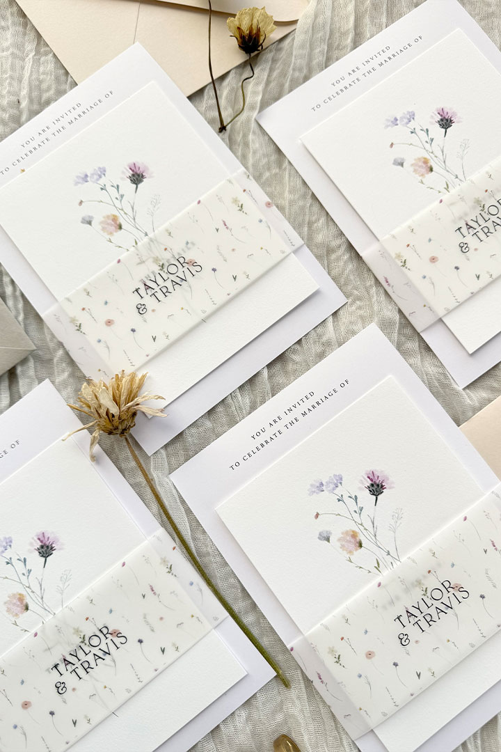
Stationery specs
- Palette: Bubblegum pink, lilac, sky blue, sunshine yellow; pastels throughout, no dark anchors
- Typographic register: Romantic, slightly retro script; playful swash capitals; nothing stiff or formal
- Print method: Digital print on blush stock (300gsm) or deeper color stock for saturated pastels; metallic print for a shimmer effect without the full foil price
- Paper weight: Digital blush or color stock at 300gsm; the Lover aesthetic is about color saturation, not weight
- Envelope treatment: Pastel lilac or pink envelope; heart-motif or color-block liner; butterfly or heart wax seal as the closure
Folklore (2020)
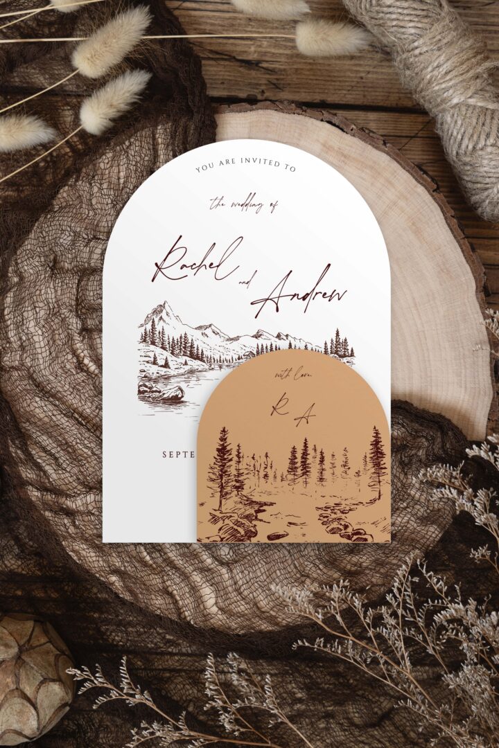
Introspective and poetic, Folklore brings a sense of quiet romance and natural beauty. Perfect for outdoor weddings, candlelit ceremonies, or intimate gatherings, this era favors nature-forward design: handwritten fonts, botanical sketches, muted tones that look like they belong in a forest clearing. The Potrey Invitations evoke that enchanting woodland atmosphere where every detail feels personal and heartfelt.

Stationery specs
- Palette: Dusty sage, soft gray, warm oatmeal, moss; nothing bright, nothing synthetic
- Typographic register: Understated serif or fine handwritten script; lowercase preferred; quiet elegance, not a statement piece
- Print method: Letterpress on Wild Cotton 600gsm is the standout choice, the pressed impression in the thick cotton paper mirrors the era’s tactile intimacy in a way no other method can. Pair with a vellum wrap for an ethereal, layered effect.
- Paper weight: Wild Cotton 600gsm double-thick for letterpress; the weight and texture are central to the aesthetic
- Envelope treatment: Natural kraft or oatmeal linen envelope; simple botanical illustration liner or no liner at all; pressed dried flowers as the closure
Browse letterpress wedding invitations, Wild Cotton is the defining paper choice for a Folklore-inspired suite.
Evermore (2020): Autumnal Nostalgia
Evermore is Folklore‘s sister album but darker and more autumnal: chestnut, terracotta, golden maple, the quiet of an evening after the leaves have turned. Where Folklore is a summer afternoon in the woods, Evermore is what happens when the light gets lower and the stories get heavier. Wedding stationery for this era is warmer and more deliberate, the kind of invitation that makes you feel something before you’ve read the date.
Stationery specs
- Palette: Chestnut, terracotta, golden maple, deep forest green, burnt sienna
- Typographic register: Old-style serif or typewriter-adjacent lettering; literary and deliberate; unhurried line-spacing
- Print method: Letterpress on Wild Cotton 300gsm for a pressed, intimate feel; or metallic print on matte stock for an aged-gold effect with shorter lead time
- Paper weight: Wild Cotton 300gsm letterpress; heavier than standard but not double-thick, the weight should feel considered, not theatrical
- Envelope treatment: Deep forest green or rust-colored envelope; wax seal with a pressed-botanicals motif; no foil liner, this era earns its elegance through texture, not shine
Browse letterpress invitations and pair them with earthy color envelopes for an Evermore-inspired stationery suite.
Midnights (2022)
The Midnights era brought a deep, dreamy midnight blue palette, dark navy and rich teal backgrounds with silver or lavender foil lettering. It’s a natural fit for evening or winter weddings where the mood is intimate, candlelit, and slightly mysterious.
Stationery specs
- Palette: Deep navy, midnight blue, lavender, silver, pale celestial blue
- Typographic register: Elegant italic serif or fine script; dreamlike and slightly formal; the aesthetic rewards restraint
- Print method: Flat foil in silver or celestial blue on 270gsm or 500gsm navy color stock; or white ink on navy for a softer, more intimate read where the invitation glows rather than gleams
- Paper weight: 500gsm color stock for maximum drama; 270gsm if you want a more understated weight
- Envelope treatment: Navy envelope with silver flat foil liner; or dusty lavender envelope with silver foil details; a dark wax seal to close
If your wedding journey has felt like its own Eras Tour, a celebration of every chapter you have been through together, consider weaving multiple era touches across your suite. A Folklore-inspired invitation with a Lover color accent, or a Reputation-style envelope liner hiding a softer, more romantic Fearless invitation inside. The contrast can be intentional and meaningful. Browse the full wedding invitation collection to mix and match aesthetics that tell your own story.
The Tortured Poets Department (2024): Raw and Undecorated
The Tortured Poets Department is Taylor’s most stripped-back and confessional album: typewriter imagery, bone white pages, deliberate rawness. It rejects ornamentation entirely. For couples drawn to this era, the stationery challenge is doing less, and making that restraint feel like a considered choice rather than an incomplete one.
Stationery specs
- Palette: Bone white, ash gray, dense black; the color palette of a typed manuscript left on a desk
- Typographic register: Typewriter-style monospace or a bare, unadorned serif; deliberate imperfection is the aesthetic; avoid anything polished or scripted
- Print method: Letterpress on Wild Cotton 300gsm, the physical impression pressed into the page mirrors the album’s raw vulnerability; the deboss becomes the only decoration
- Paper weight: Wild Cotton 300gsm; natural and unbleached, the texture does the emotional work
- Envelope treatment: Plain white or natural kraft envelope; no foil liner; guest addresses written by hand rather than printed labels; plain wax or no seal at all
Browse letterpress wedding invitations on natural cotton stock for stationery that makes restraint feel like a deliberate statement.
The Life of a Showgirl (2025)
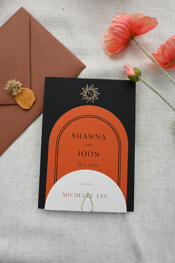
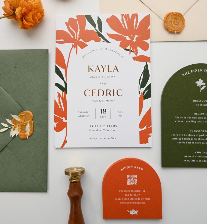
Taylor’s latest era, The Life of a Showgirl, is vibrant, glamorous, and made for the big stage. For a wedding inspired by this album, think metallics, burnt orange and mint color palettes, high-shine finishes, and a touch of glitz. Invitations printed on orange stock with mirror foil and bold typography reflect the spotlight-ready aesthetic of this era. Our Solis Invitations capture those vibrant, glamorous vibes, perfect for a modern wedding.
Stationery specs
- Palette: Burnt orange, mint green, hot pink; vibrant and theatrical; mirror-bright metallics as accents throughout
- Typographic register: Bold art-deco or high-fashion display type; maximalist and unapologetically loud; this is not the era for understatement
- Print method: Color stock with flat foil, real foil on European-sourced color card in orange or mint; the mirror-bright foil against vivid stock is the stage-ready effect this era demands
- Paper weight: 500gsm color stock if you want the invitation to carry the same weight as the performance
- Envelope treatment: Bright-colored envelope to match the invitation stock; foil-lined for the full theatrical reveal when guests open it
Era at a Glance: Finding Your Invitation Style
Not sure which browse collection best fits your chosen era? Use this as your starting point. Each link goes to the category page, use the print method and color filters on the page to narrow down.
| Era | Best starting point | Why it fits |
|---|---|---|
| Debut / Fearless | Foil wedding invitations | Gold flat foil on ivory is the defining technique for both golden-era albums |
| Speak Now / Reputation / Midnights | Foil wedding invitations | White ink on dark stock or foil stamp on color stock for dramatic contrast |
| 1989 | Foil wedding invitations | Silver flat foil on white or pale blue stock for the clean pop aesthetic |
| Folklore / Evermore / TTPD | Letterpress wedding invitations | Pressed impression in Wild Cotton is the tactile match for all three introspective eras |
| Lover | Wedding invitations | Filter by blush and soft color stock for the pastel palette |
| Red / Evermore | Wedding invitations | Filter by deep color stocks for autumn and earthy palettes |
| The Life of a Showgirl | Foil wedding invitations | Vivid color stock with flat foil is the standout technique for the stage-ready look |
Bring Your Era to Life
Whether you’re inspired by the soft glow of Lover or the confident edge of Reputation, your Taylor Swift wedding invitations can set the tone for your dream celebration. With Paperlust’s wide range of exclusive designs, all customizable and printed on luxe paper, it’s never been easier to turn your favorite Taylor Swift album into your wedding era.
How to Choose Your Taylor Swift Era Theme
Not sure which era fits your wedding? Here’s a simple way to think about it.
Start with your venue and time of year. An autumn vineyard wedding naturally gravitates toward the Red era’s warmth. A forest or mountain ceremony feels unmistakably Folklore. A city rooftop or modern loft suits Reputation’s stark glamour. A sunlit garden in June is pure Fearless or Lover energy.
Then think about your personality as a couple. Are you maximalist or minimalist? Romantic or ironic? Bold or understated? Taylor’s catalog contains multitudes, and so do her invitation equivalents. The right era is the one that feels most authentically yours, not the album you happened to be listening to when you got engaged.
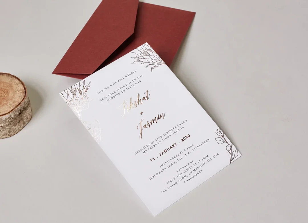
Finally, consider your partner’s aesthetic input. A Taylor Swift-themed wedding works best when both partners feel genuinely represented by the era you choose. If one of you loves Folklore’s muted elegance and the other loves Lover’s maximalist pink, there are designs that split the difference, soft romantic florals with a hint of color, or neutral palettes with bold typographic details.
Era-Inspired Wording Ideas
The right lyric or lyric-adjacent phrase can set the tone for your entire invitation. Here are some starting points inspired by each era, adapt freely to match your own personalities.
Red era: “Long story short, we fell in love” works as a caption or insert card tagline. For the invitation header, a simple bold serif statement in deep red or burgundy says everything.
Reputation era: “I’ve got a blank space, and I wrote your name on it” as a personal note to guests. For the formal wording, stark contrast, white text on black, or black on ivory, with no decorative flourish.
Lover era: “My heart was yours” or “And I would marry you a hundred times” as a quote on a separate insert card or envelope liner. The invitation itself can be soft and floral with the romantic wording inside.
Folklore/Evermore: A simple, literary phrase from the album that means something personal to you. These eras favor quieter, more specific language, resist the urge to be flowery. Let the typography and texture do the emotional heavy lifting.
Note: Avoid copying specific lyrics verbatim on commercial printed materials without licensing consideration. Paraphrase freely, use the aesthetic language of each era, or include lyrics as personal handwritten notes rather than printed text.
Completing the Era Suite
A truly immersive Taylor Swift era wedding experience goes beyond the invitation card. Here’s how to carry the theme through your full stationery suite.
Save the dates: The first piece your guests receive should hint at the era without giving everything away. A subtle color palette and typeface choice sets the tone 6 to 8 months out. Browse save the dates from $1 per card.
RSVP cards: Match the typographic style of your invitation era. A Reputation couple might choose stark black-and-white cards with a foil detail; a Folklore couple might prefer a simple letterpress card on natural cotton. Browse RSVP cards to complete the suite across all print methods.
Wedding menus: For a seated reception, a printed menu is the stationery piece your guests read at the table. Match your era’s palette and typeface. Browse wedding menus styled from Lover pastels to Reputation black-and-gold.
Place cards: Small but noticed. A Folklore wedding might use a simple letterpress place card on natural cotton; a Showgirl wedding might use a bright color stock card with a foil-printed name. Browse wedding place cards across all print methods and stocks.
Welcome signs and table numbers: Match the typographic style of your invitations. Folklore couples might lean into hand-lettered signage; Reputation couples will want sharp, high-contrast printed signs.
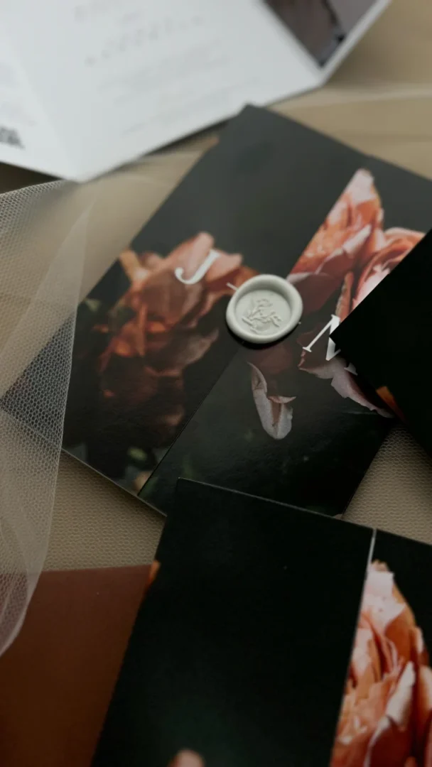
Custom envelope seals: A small monogram or era-specific design element as a wax seal or printed sticker closure is the kind of detail devoted Swifties will notice. Custom round stickers from Paperlust Print Shop are a perfect finishing touch, affordable, quick to produce, and highly customizable. Wedding invitations start from $2.04 per card across all eras and print methods.
Frequently Asked Questions
What is a Taylor Swift era wedding invitation?
A Taylor Swift era wedding invitation is a design inspired by the aesthetic, color palette, and mood of one of Taylor Swift’s album eras, Red, Reputation, Lover, Folklore, Evermore, Midnights, The Tortured Poets Department, or The Life of a Showgirl. Each era has a distinct visual identity that translates into wedding stationery design choices including color, typography, print method, and overall theme.
Which Taylor Swift era is best for a wedding invitation?
It depends on your wedding aesthetic. Folklore and Evermore suit minimalist, romantic forest or outdoor weddings. Lover fits bright, floral, or maximalist celebrations. Reputation works for glamorous or evening weddings. Red suits autumn weddings with warm tones. Fearless and Speak Now align with golden, romantic, or countryside themes. Midnights is ideal for winter or evening weddings with deep navy and silver.
Can I use Taylor Swift lyrics on my wedding invitations?
Using specific lyrics verbatim on printed materials can raise copyright questions for commercial printing. It’s generally fine for personal use. To be safe, paraphrase the lyric in your own words, use it as a personal handwritten note, or focus on the era’s aesthetic rather than specific text.
How do I get a Taylor Swift themed invitation designed?
Paperlust has designs across many aesthetics that match Taylor Swift eras, from dark and dramatic Reputation-style invitations to soft floral Folklore designs. Browse the wedding invitation collection and filter by color and style, or use the custom design service to create something era-specific from scratch.
What print method suits a Folklore-inspired wedding invitation?
Letterpress on Wild Cotton 600gsm is the ideal match for a Folklore-inspired invitation. The physical impression pressed into the thick cotton paper mirrors the album’s tactile, intimate quality. For Evermore and The Tortured Poets Department, Wild Cotton 300gsm letterpress works equally well.
Does Paperlust offer matching save the dates and RSVP cards for a Taylor Swift theme?
Yes. Paperlust offers matching suites across invitations, save the dates, RSVP cards, menus, and place cards. You can match the color palette, typeface, and print method across each piece to create a cohesive era-themed suite from the first mailing through to the reception table.
Shop Wedding Invitations at Paperlust
Hundreds of wedding invitation designs you can customize online, with an online proof before you print.
Shop Wedding Invitations at Paperlust
Hundreds of wedding invitation designs you can customize online, with an online proof before you print.
The Lovers is definitely the pick for me! Such a bold choice, stands out from standard invites by a long way.
The design is beautiful, but it doesn’t seem to be the current trend. Thank you very much for your feedback.